An estate agent brand you notice from across the road.
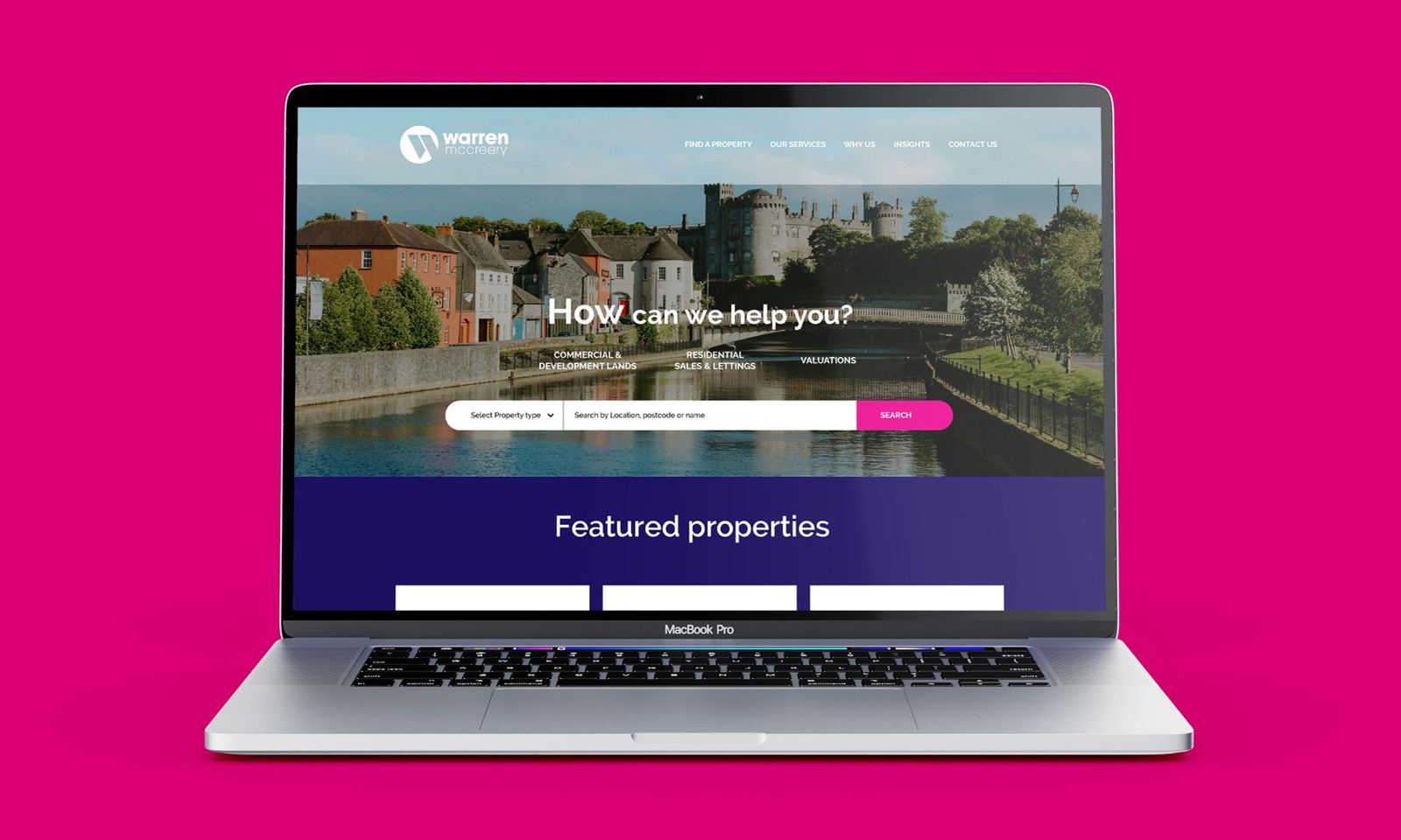
Warren McCreery is an estate agency in Kilkenny offering auctioneering, valuation and property services. In a city that size, reputation is personal and everyone knows the established names, so the brand has to stand out on every board, window and brochure while still looking like a safe pair of hands.
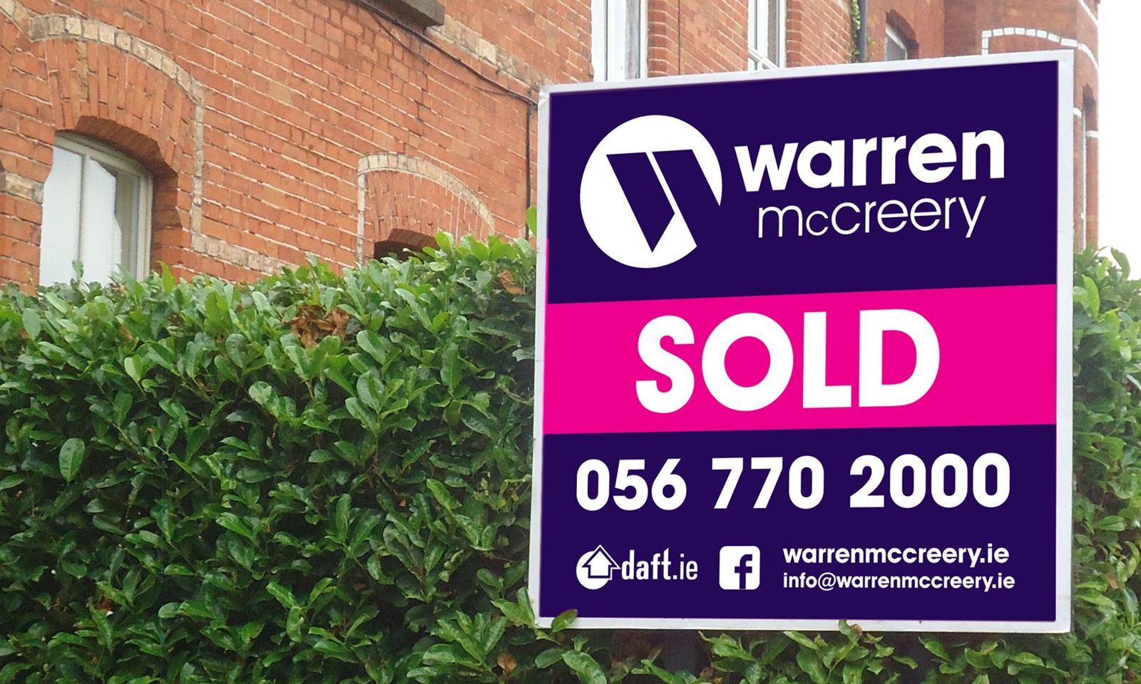
Warren needed a distinctive identity that projected trust, professionalism and strong local market knowledge.
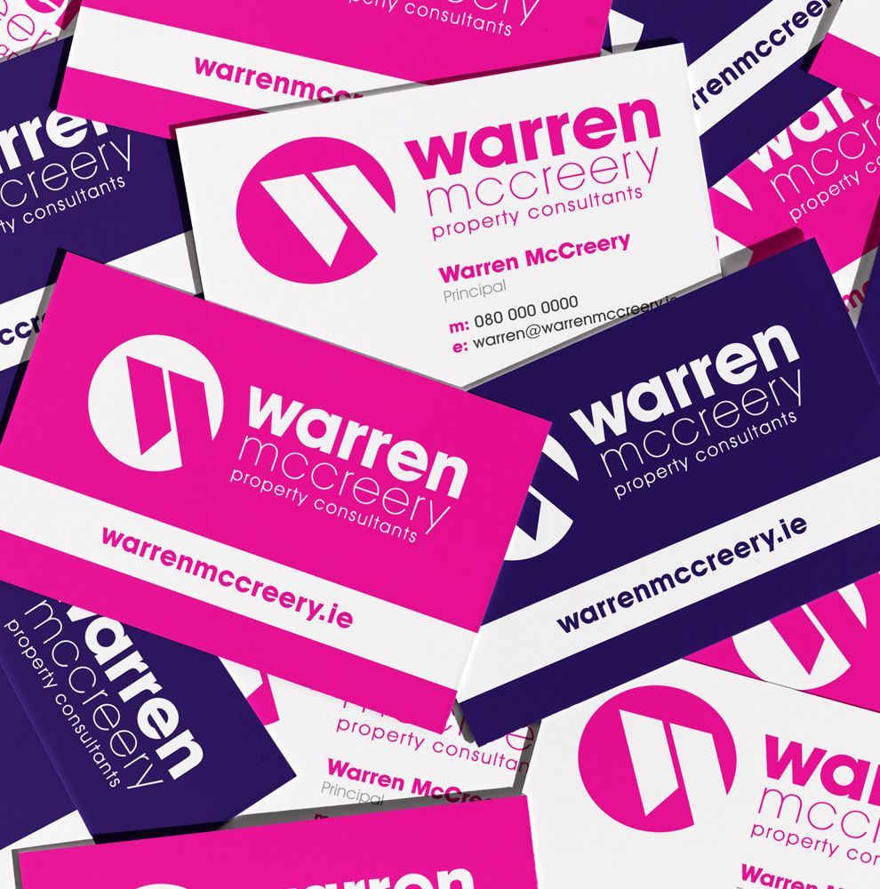
A modern visual identity inspired by property symbolism, designed to feel fresh, credible and clearly different.
More than ten years on, Warren says the logo is still strong and still doing the job it was designed for.
Impossible to miss, easy to trust.
Estate agency boards across Ireland tend to blur into the same greens, navies and roof icons. Warren needed a brand that a vendor would notice from across the road, and that still read as professional and settled.
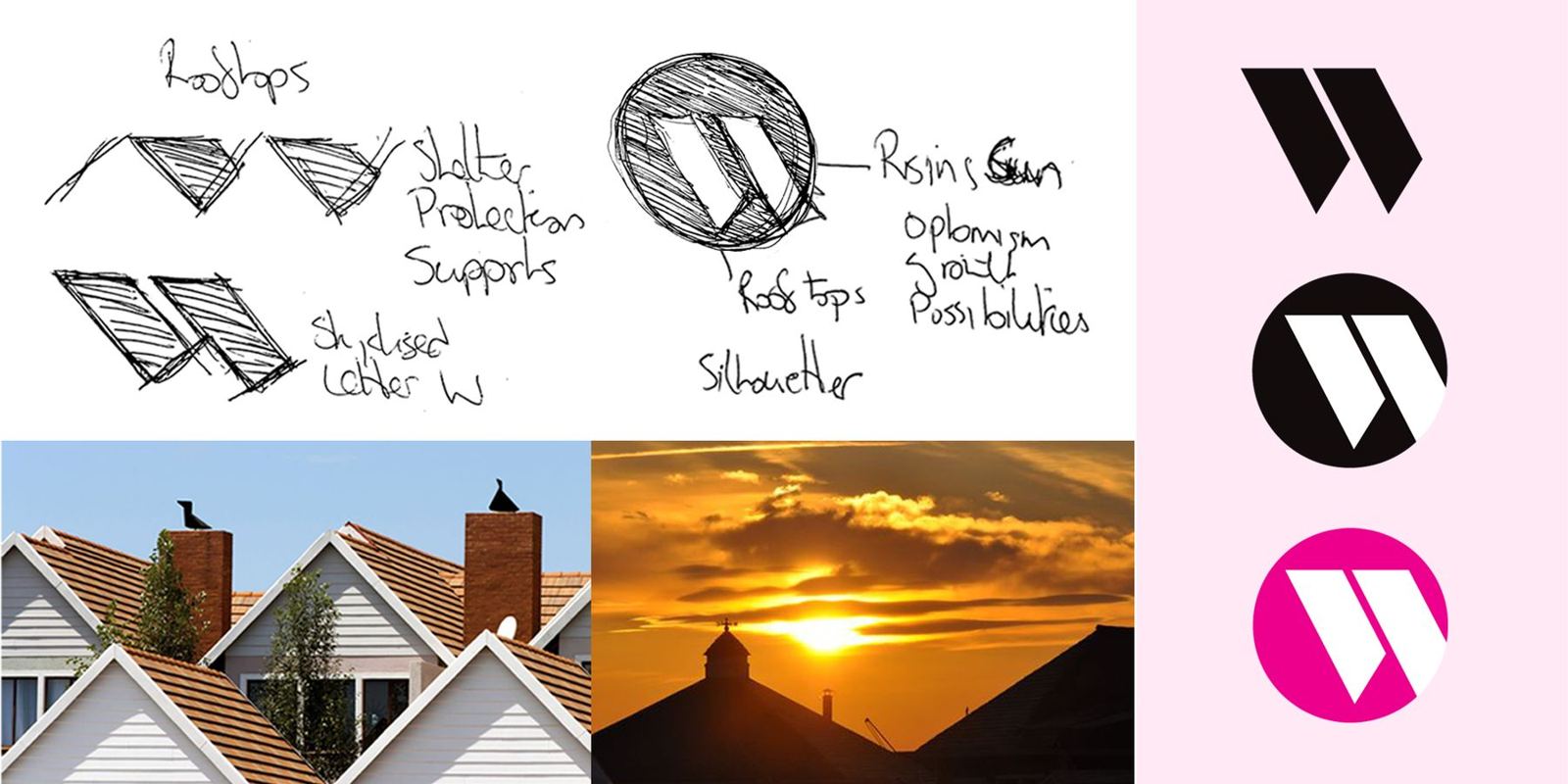
Rooftops, a rising sun, and a W.
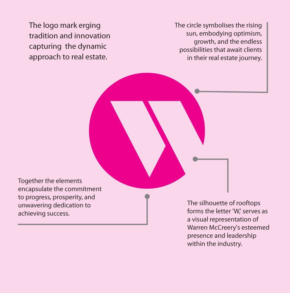
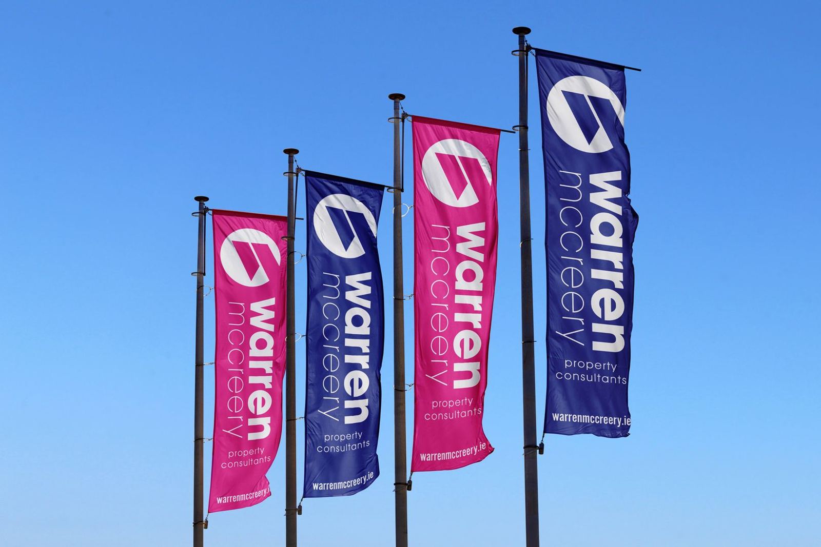
The silhouette of rooftops forms the letter W, set inside a circle that stands for the rising sun: optimism and growth for clients starting their next move. A confident magenta and deep purple make every board stand out on the street, which is exactly where an agent's brand earns its keep.

“We engaged Barry O'Connor to design a noticeable logo with a specific job of differentiating our company from that of another in the same line of business. Barry met with us personally and designed a logo from the ground up. The logo is over 10 years old and it remains strong, still doing the job we intended it for.”
Launching, growing or changing? Let's talk about your brand.
A 30-minute call about where you are and what your brand needs to do. No pitch. If you're not ready to talk yet, ask for a free review of your current brand instead.