Plan
Structure and journeys
We map how your customers find you, compare you and decide, then shape the site around that, not around an org chart.
Someone sees your board, gets your card or hears about you from a friend. Then they look you up. Your website has a few seconds to confirm they've found someone they can trust, and to make getting in touch easy.
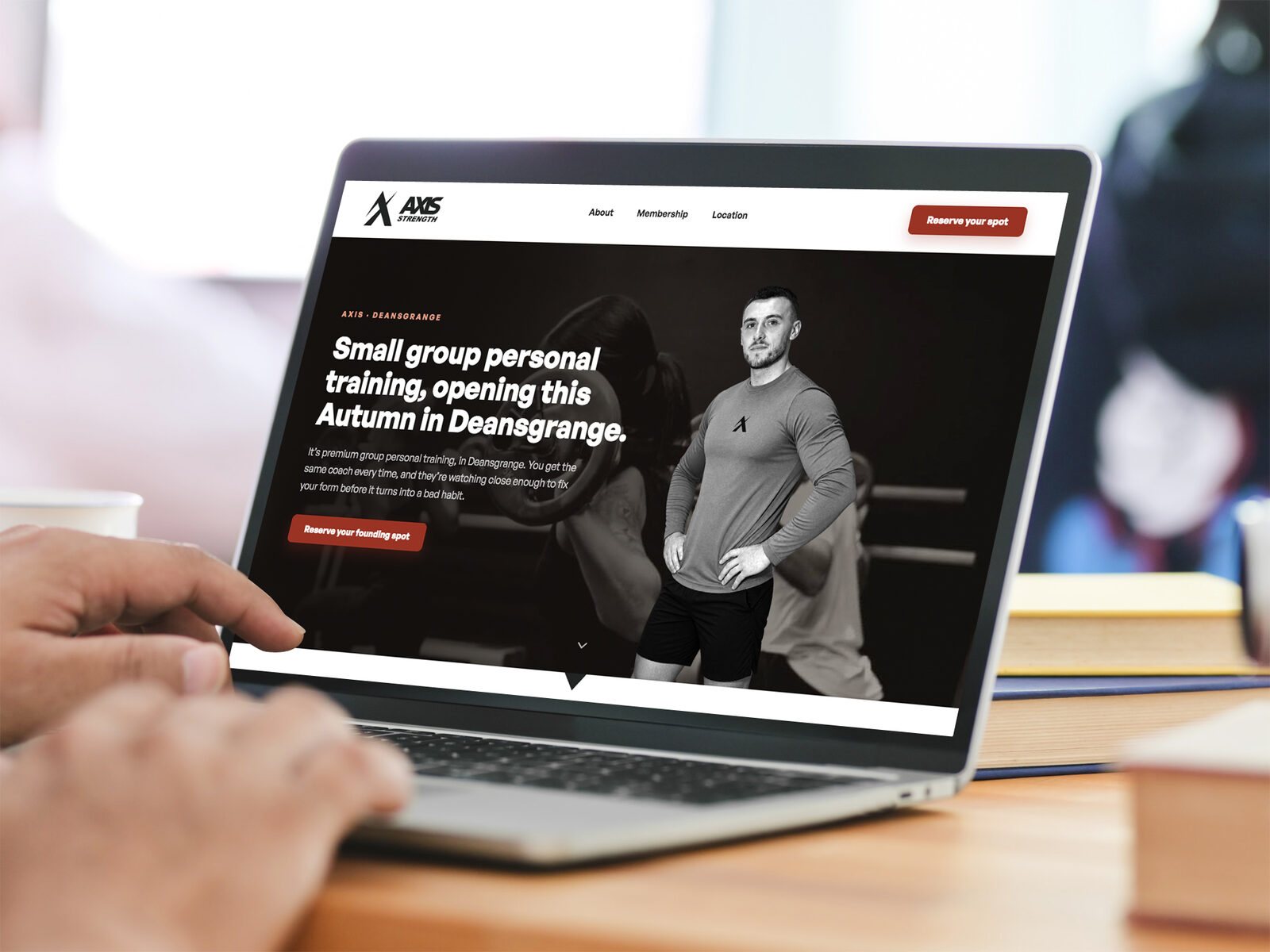
Visitors arrive, can't quickly tell what you do or why you're different, and leave for someone whose site does the job better.
I don't start a website at the homepage. I start with the people who'll use it, then design the structure, the journeys and the pages around them. Here's how that worked on the Axis launch site, which I designed, wrote and built. The research stage is from The Design Corner's online store, which went through the same process.
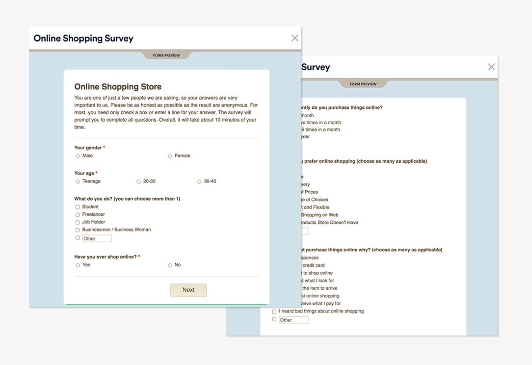
Talk to the people who'll actually use the site. For The Design Corner's online store that meant interviews and focus groups with the makers, an online survey of shoppers, and benchmarking how other craft marketplaces sell online. That store was fully designed but never went live, so it shows the process rather than results.
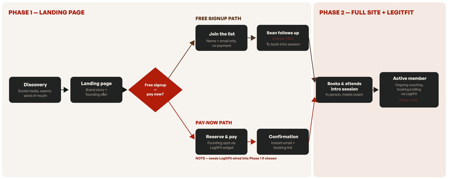
Map the journey before the pages. For Axis the big question was how people would join. A free waiting list meant Sean chasing every name. Paying upfront through LegitFit took people straight to a confirmation and a booking link, so that's the route we built.
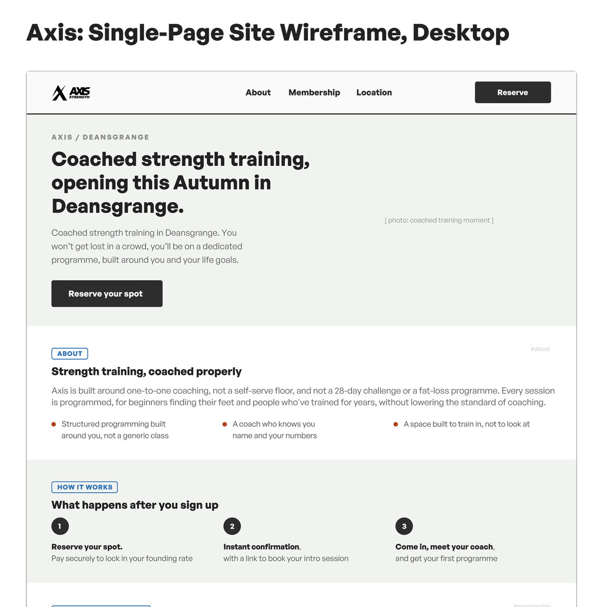
Lay out every section in plain grey boxes and agree the order first, because that's cheap to change now and expensive to change later. For Axis, the page answers the questions people have before they hand over their card: who's coaching, how big the groups are, when sessions run and what it costs.
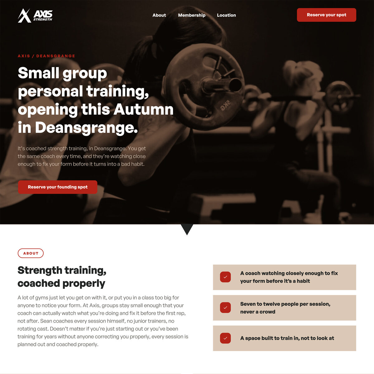
Build the page from the brand's own colours, type and patterns, so the website feels like the shopfront and the studio. Every section is made from the same parts, so it stays consistent as the site grows.
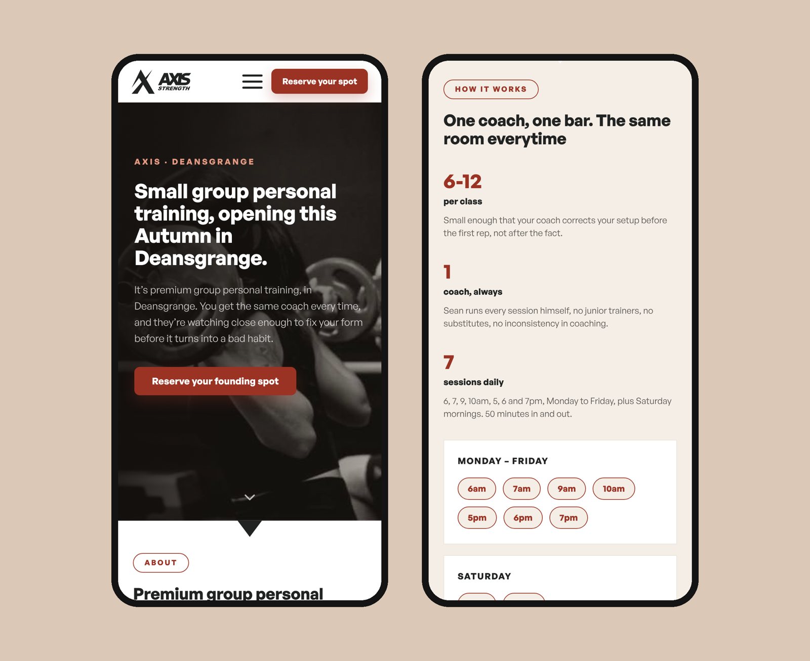
Most people arrived on a phone, from the QR codes on the door or from Instagram, so every section was designed for mobile as well as desktop. I built the site myself, and it went live a month before opening, with the privacy and refund terms in place before the first payment.
A website audit shows where people are getting stuck. Fix that, and everything you spend on marketing works harder. Three results from audits I've led:
The audit, a competitor review and user research showed people struggling to order on a phone. We redesigned the quote form and key pages, and the Irish site's conversion rate nearly tripled.
The audit came first: the site scored 13 out of 100 for mobile speed, and 92% of visitors left after one page. We fixed the site, then ran the campaign. It reached 785,000 people, and 30% of sales were put down to digital.
The audit found the "Register" button didn't work on a phone, and there was no way back to the site after signing up. We fixed both before the campaign started. Over the next eight months it brought in more than 2,000 leads, and when a new phase launched, an email to those leads helped it sell out on preview night.
All three projects were run by my agency, Red Man Media, in 2015 and 2016.
Every website starts from your brand strategy. If you don't have one yet, that comes first, because a site built without it usually needs rebuilding.
We map how your customers find you, compare you and decide, then shape the site around that, not around an org chart.
Your story told for the person reading it. I write the page copy as part of the project, so it's never the bit that holds the launch up.
Mobile-first design, on-page SEO, fast loading and analytics set up, so it's ready to be found and you can see what's working.
"Red Man Media delivered and exceeded our expectations with regards to our digital marketing campaigns. They understood our needs and were very responsive to our requirements. They delivered fantastic results for the development and we would not hesitate in recommending them."
A 30-minute call about where you are and what your brand needs to do. No pitch. If you're not ready to talk yet, ask for a free review of your current brand instead.