A construction brand that caught up with the projects.
Regan Construction has over two decades of experience delivering residential and commercial projects across Kildare and the surrounding region. As the business grew into bigger, more complex projects, its identity no longer reflected the quality, professionalism and scale of the work.
A refreshed identity that reflected their growth, modern approach and capability across large-scale projects.
A contemporary visual identity that communicates strength, reliability and forward-thinking professionalism.
Regan now has a confident, unified brand that supports business development and changes how clients see them.
Solid, upright and unmistakably green.
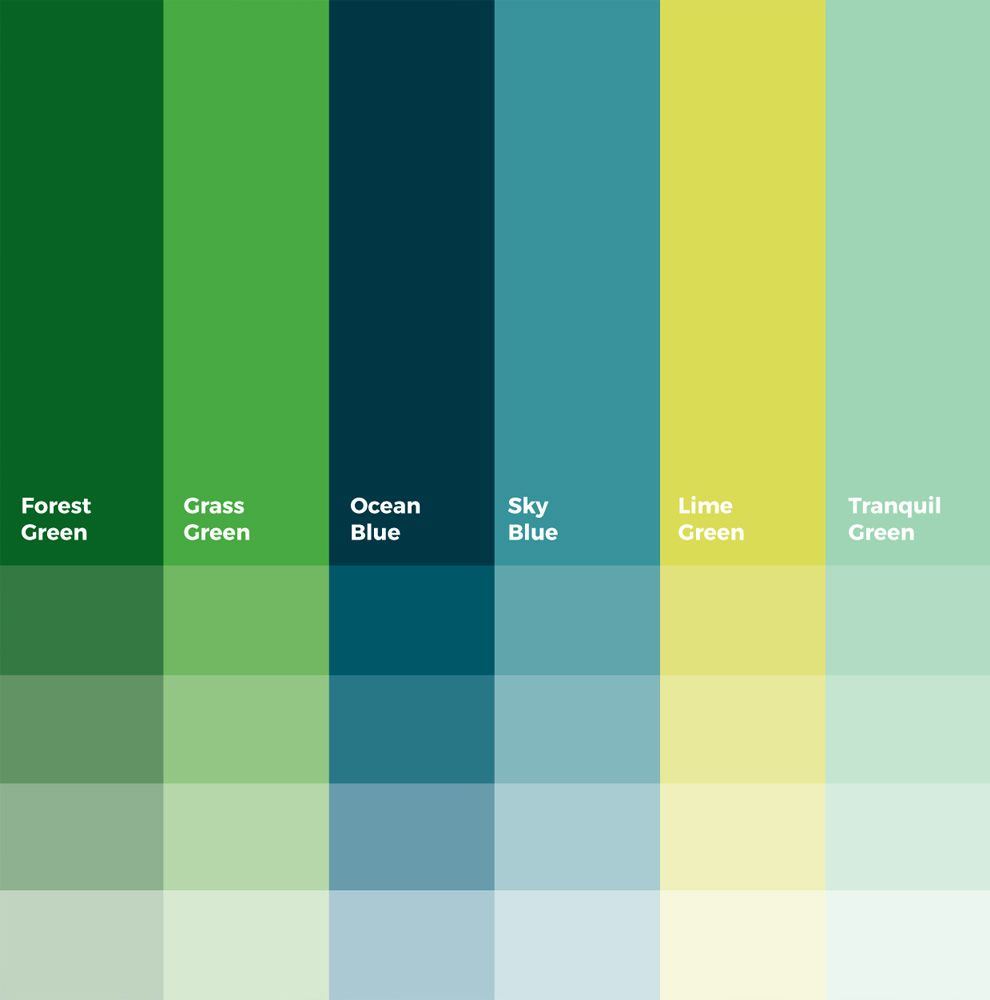
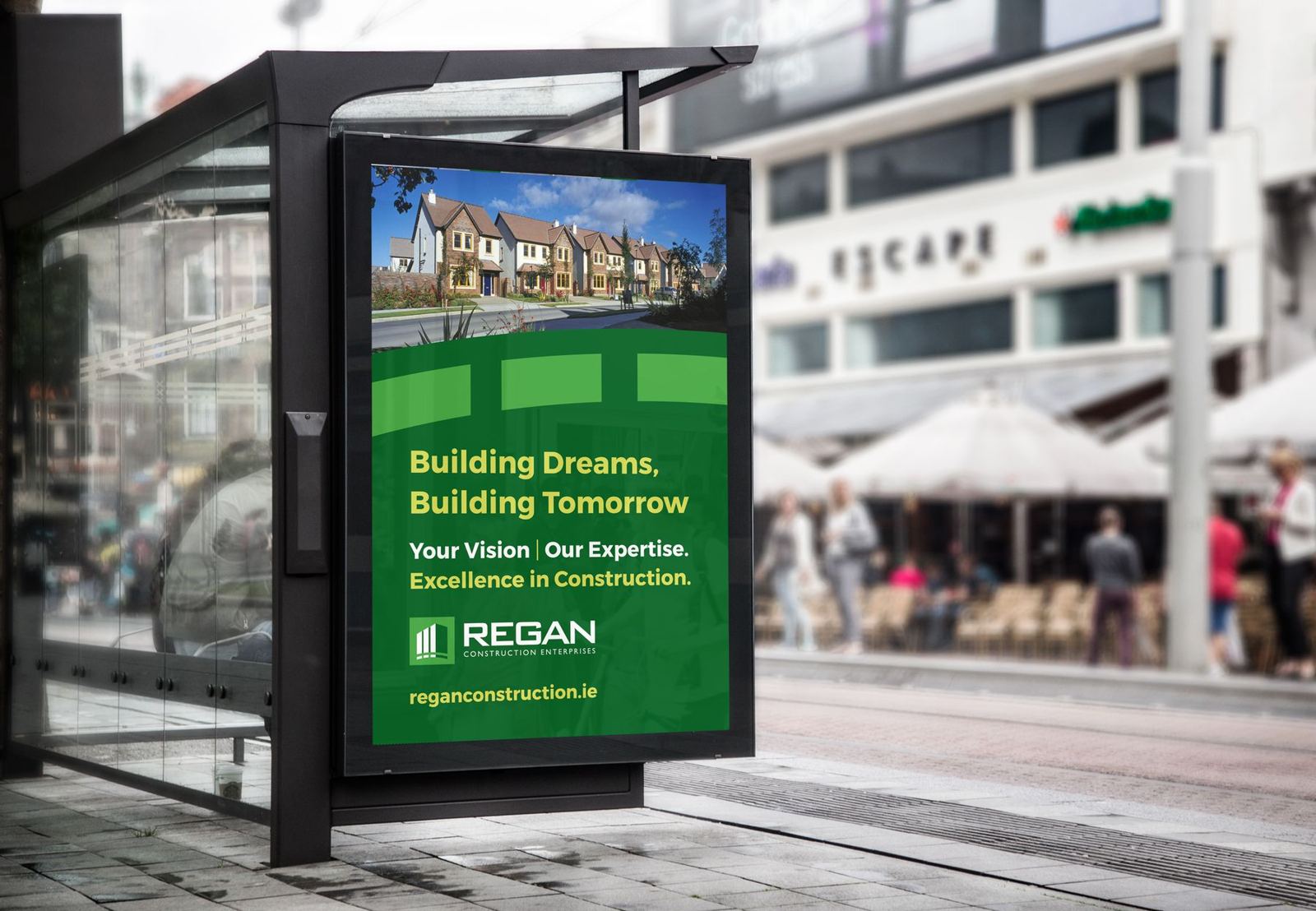
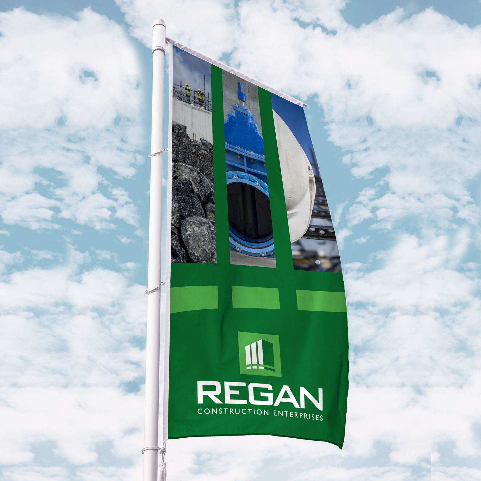
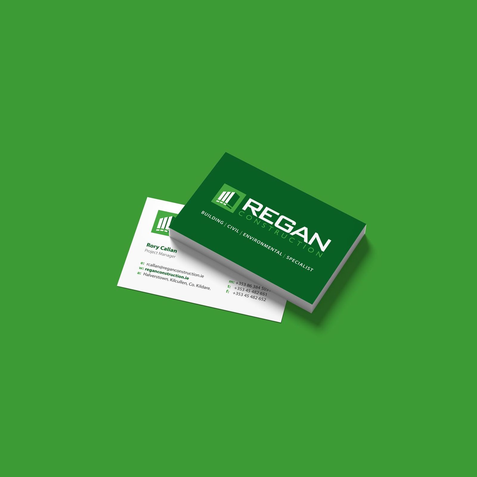
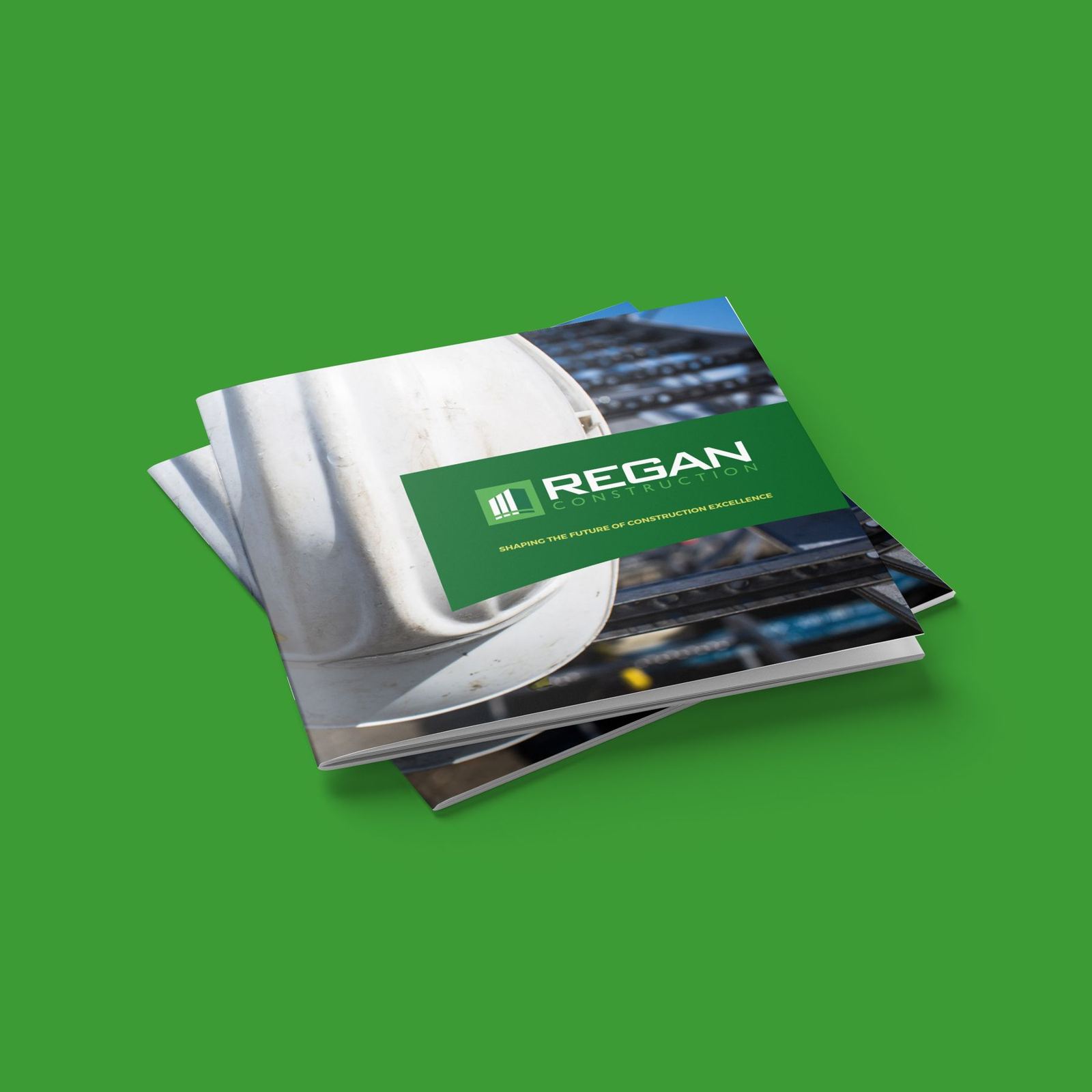
The refreshed mark is built from upright columns that read as a building rising, with a strong wordmark beside it. A palette running from Forest Green to Lime Green gives Regan a colour it can own on hoardings, vans and site signage.

Launching, growing or changing? Let's talk about your brand.
A 30-minute call about where you are and what your brand needs to do. No pitch. If you're not ready to talk yet, ask for a free review of your current brand instead.