A new builder that looked established from the first flag.
Foxstone launched as a new construction and property management company in South Dublin. The founders had over 40 years of combined experience, but homeowners had never heard the name.
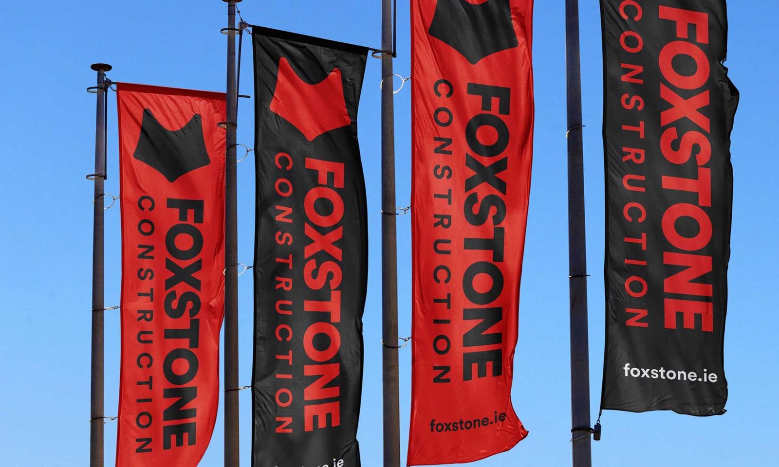
They needed a premium, distinctive identity to stand out in a crowded construction market and reflect the quality of their work.
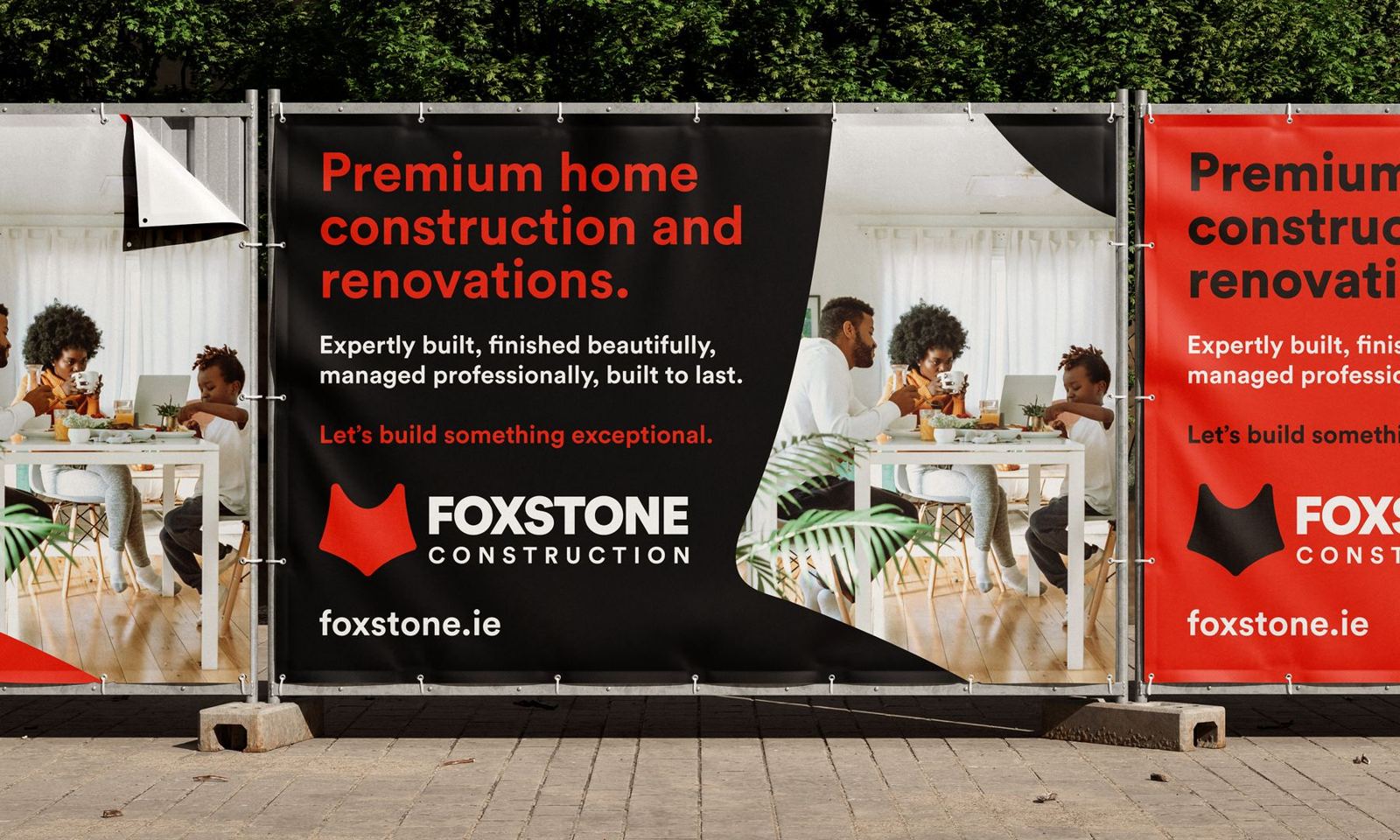
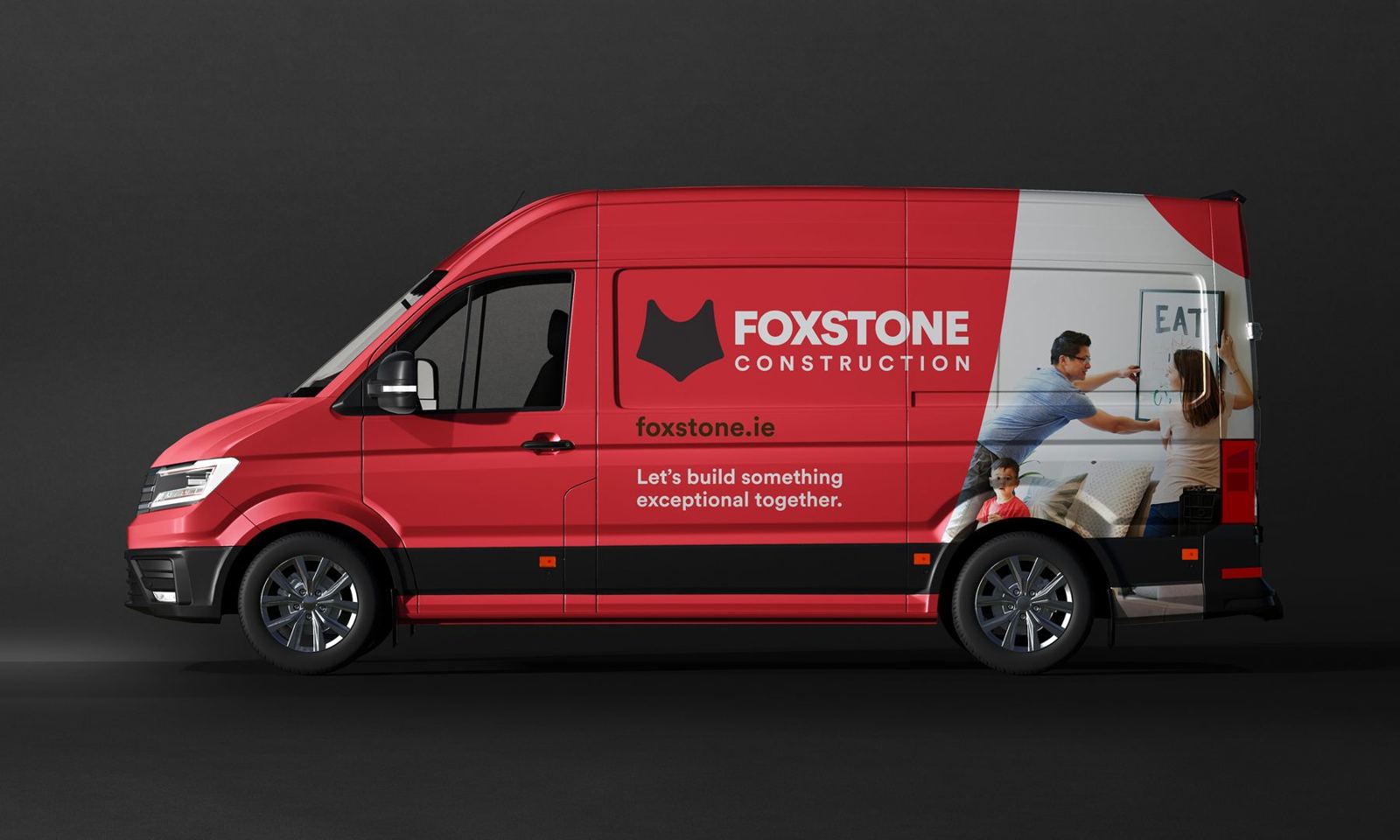
A bold, modern visual identity inspired by local heritage, designed to communicate trust, clarity and professionalism.
Foxstone launched with a confident, memorable brand that positions them as a high-quality, reliable construction partner from day one.
A market of hard hats and house icons.
Construction branding in South Dublin is crowded with the same few ideas: hard hats, house icons and templated logos. Foxstone needed to show premium quality and professionalism straight away, and give homeowners a reason to trust a name that was brand new.
The people Foxstone wanted to work for were clear from the first sketches: homeowners planning high-end builds and renovations, who expect quality and will pay for it.
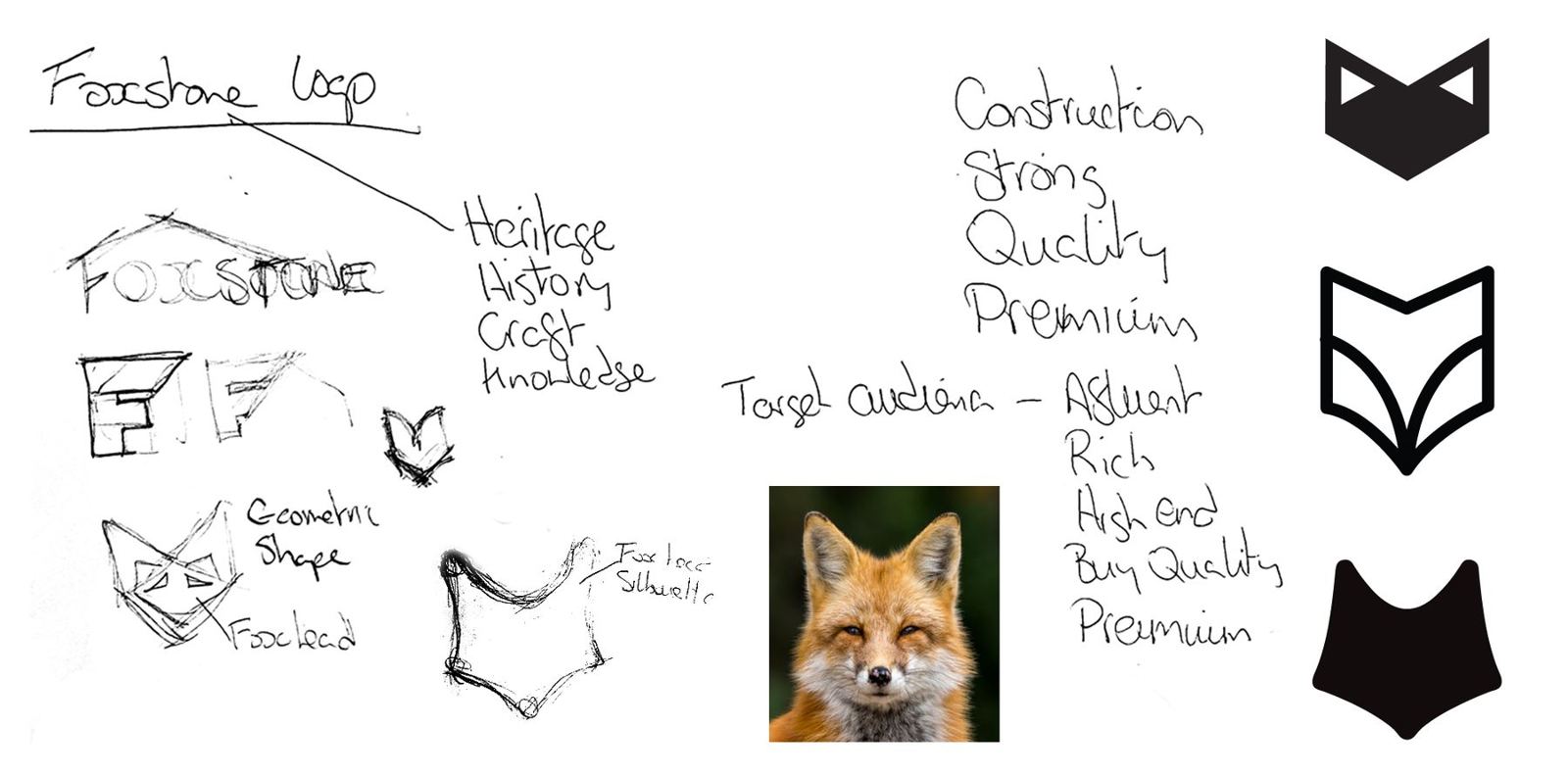
A mark rooted in the place.
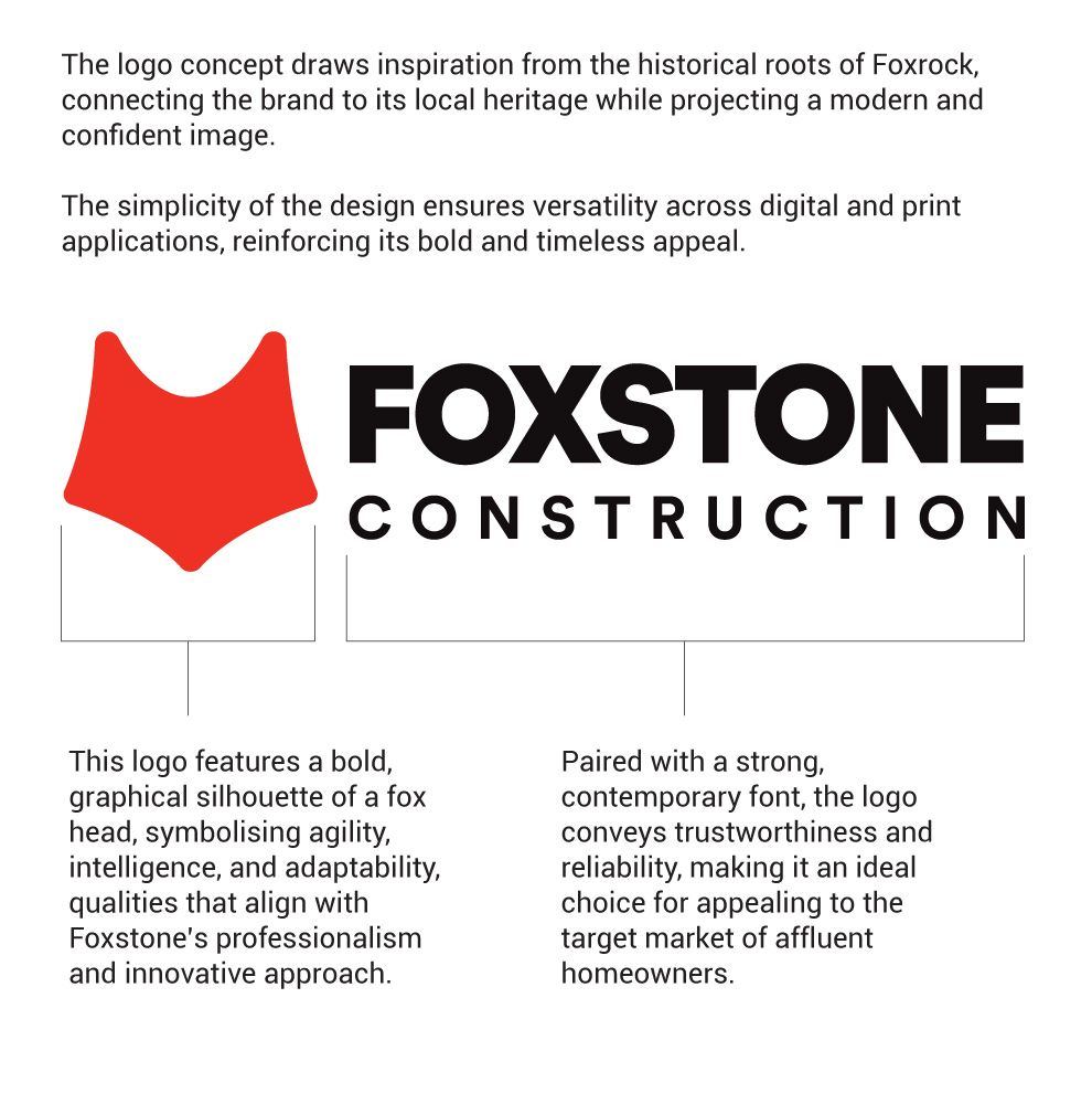
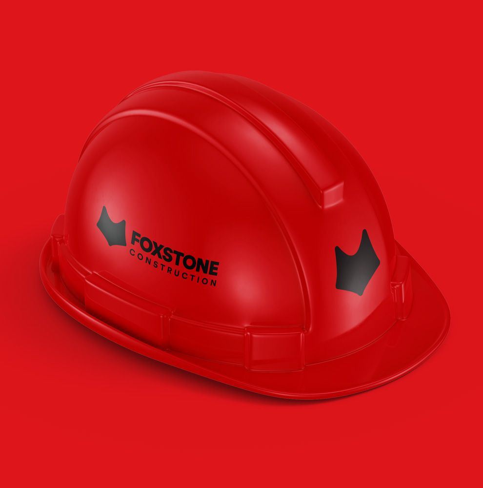
The mark draws on Foxrock's local heritage: a simplified fox head, referencing the foxes that once roamed the area. It suggests agility, intelligence and adaptability, qualities that translate directly to building.
Strong, contemporary type and a refined palette finish an identity that feels modern and premium, and nothing like the competition.
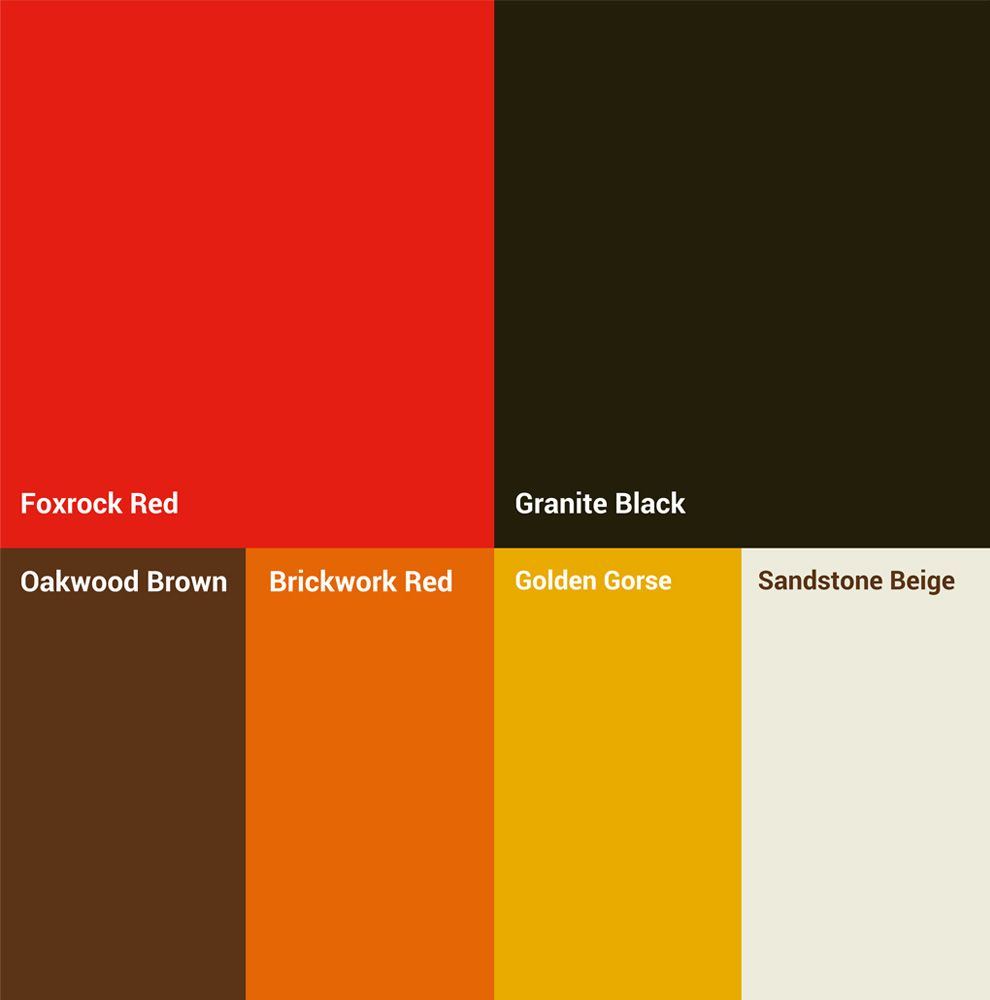
Colours taken from the materials.
Foxrock Red and Granite Black lead, supported by Oakwood Brown, Brickwork Red, Golden Gorse and Sandstone Beige. Every colour has a name that ties it back to the trade and the area, which makes it easier for the team and their suppliers to use consistently.

Launching, growing or changing? Let's talk about your brand.
A 30-minute call about where you are and what your brand needs to do. No pitch. If you're not ready to talk yet, ask for a free review of your current brand instead.