A builder named after two dogs, ready for bigger projects.
Douglas & Stewart deliver residential, commercial and heritage projects across Ireland. The business had grown, and the old identity no longer reflected the scale or expertise of the work. This was a Red Man Media project from when I ran the agency. I designed the logo, the identity and the brochure, and one of my design team designed the website.
Their identity no longer reflected the experience, capability and range of expertise the business had built over time.
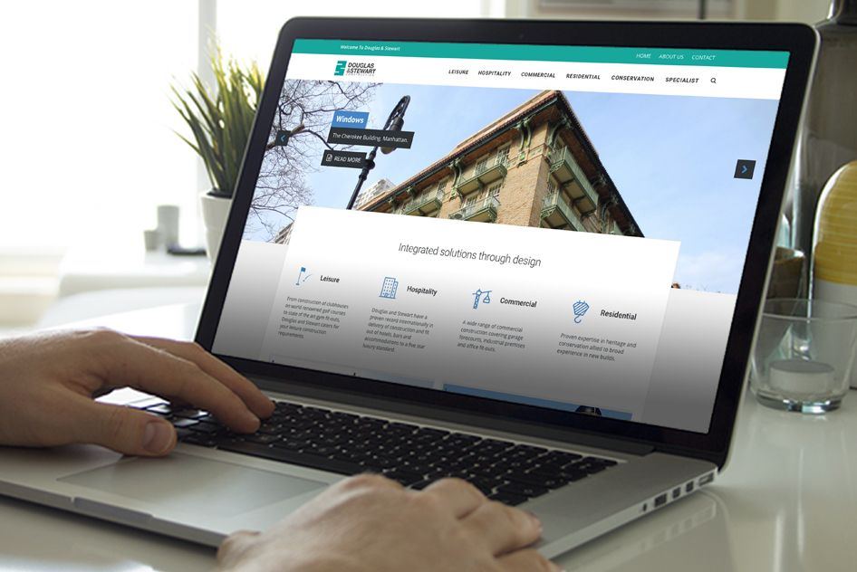
A clean, modern brand and website that communicate quality, stability and the breadth of their construction services.
Douglas & Stewart now present a cohesive, credible brand that strengthens their profile and supports competitive tendering.
A great story, and a brand that undersold the work.
Their projects range from leisure facilities and golf clubhouses to manor house refurbishments, industrial buildings, office fit-outs and motor forecourts. The company is named after the owners' two dogs, which gave it a memorable, personal foundation.
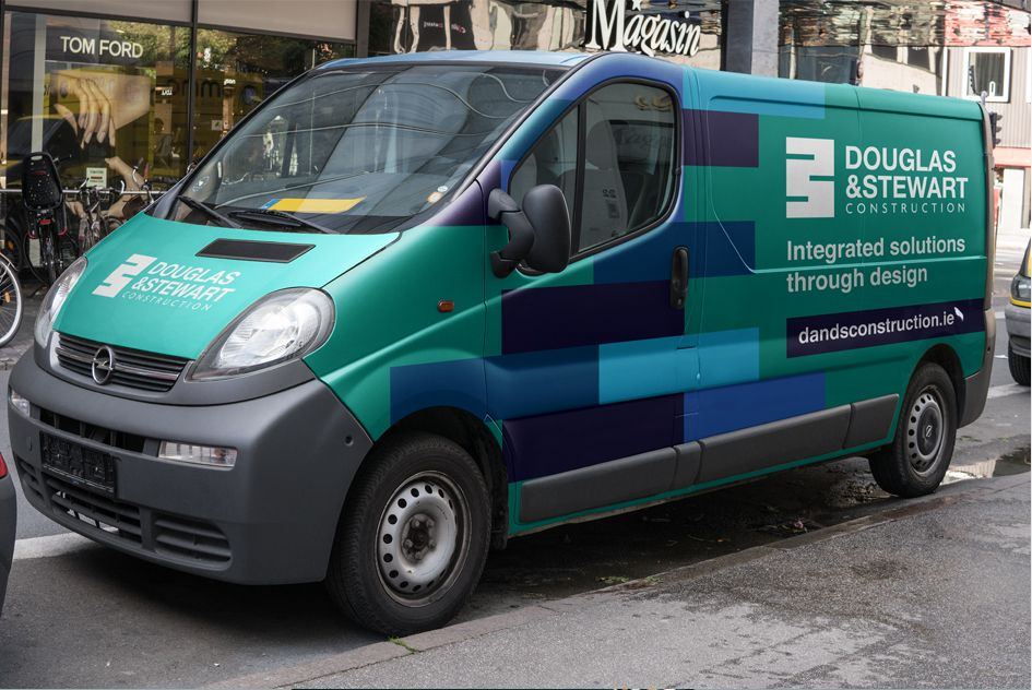
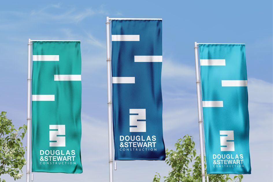
The challenge was to honour that story while presenting a credible, modern firm able to compete for larger, more complex projects, on everything from site signage and vehicles to tender documents and the website.
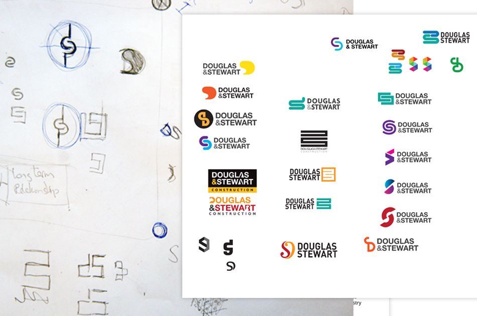
Built from a course of bricks.
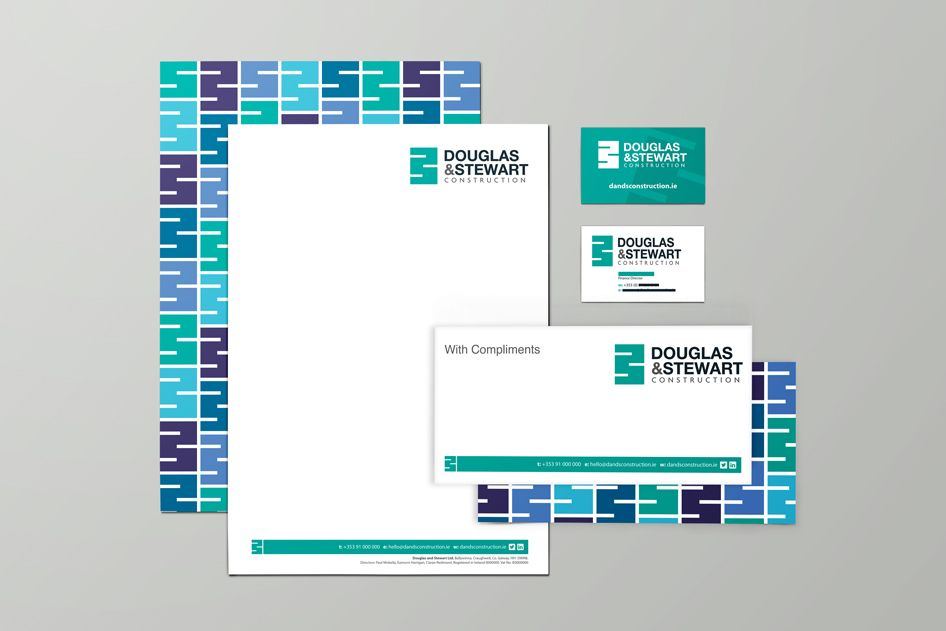
The mark takes its cue from brickwork: the offset pattern of a real brick course, abstracted into a clean geometric form. Its three offset bars carry the D and S initials while pointing to the core material of the trade: strength, stability and resilience.
Badge and icon versions let the brand flex across signage, documents, vans and digital, while staying consistent.


“When it came to both the production of a brochure and our website we chose Red Man Media. Our choice was fully vindicated as their work became a crucial part of our marketing campaign.”
Launching, growing or changing? Let's talk about your brand.
A 30-minute call about where you are and what your brand needs to do. No pitch. If you're not ready to talk yet, ask for a free review of your current brand instead.