A new strength studio, trusted before the doors opened.
Sean Kennedy was opening Axis, a small-group strength studio in Deansgrange. He had the premises, a clear idea of how he wanted to coach and people ready to follow him. What he didn't have was a brand: no logo, no website, no signage, and an opening date that wasn't going to move.
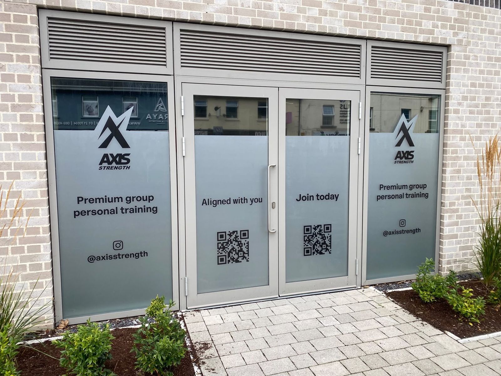
Nobody knew Axis yet. People would decide whether to trust it on how it looked and sounded, long before they met Sean.
A strategy built on what members would actually notice in a session, then a mark, a palette and a rollout that all said the same thing.
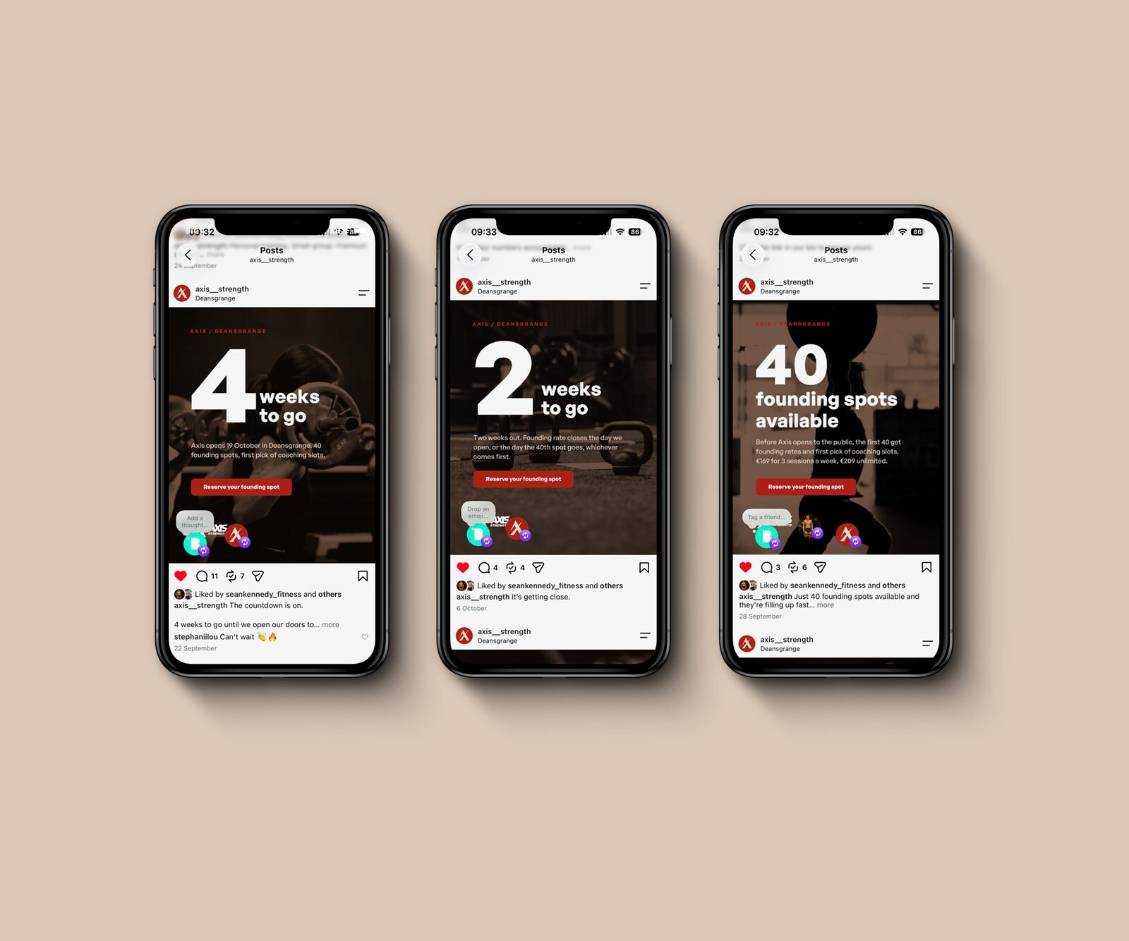
Everything was ready together for opening day. Over 40 members joined in the first few weeks, including 8 people who had never met Sean before.
Beginners and competitors in the same room.
Axis is for someone lifting for the first time and for someone training for a Hyrox. Lean too hard into performance and the beginner feels out of their depth. Lean too soft and the serious competitor walks straight past. The brand had to talk to both in one voice.
Sean also wanted Axis to feel premium without pricing people out. That's a harder brief than it sounds, because most "premium" gym branding just means black, gold and a big price tag.
Premium means being looked after.
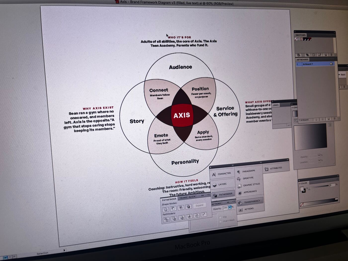
Before any design, Sean worked through a brand workbook, and we went back and forth on his answers until the thinking was solid. The most useful question was a simple one: what would a member actually notice in a session that makes it feel premium?
His answers became the backbone of the brand: coaching with real attention to detail, a spotless gym where everything works, every exercise scaled to the person in front of you, sessions with a clear structure, and coaches in clean, branded kit.
That list gave the beginner and the competitor the same promise: a coach who's watching your form and knows where you're going next.
Warm and grounded, not cold and clinical.
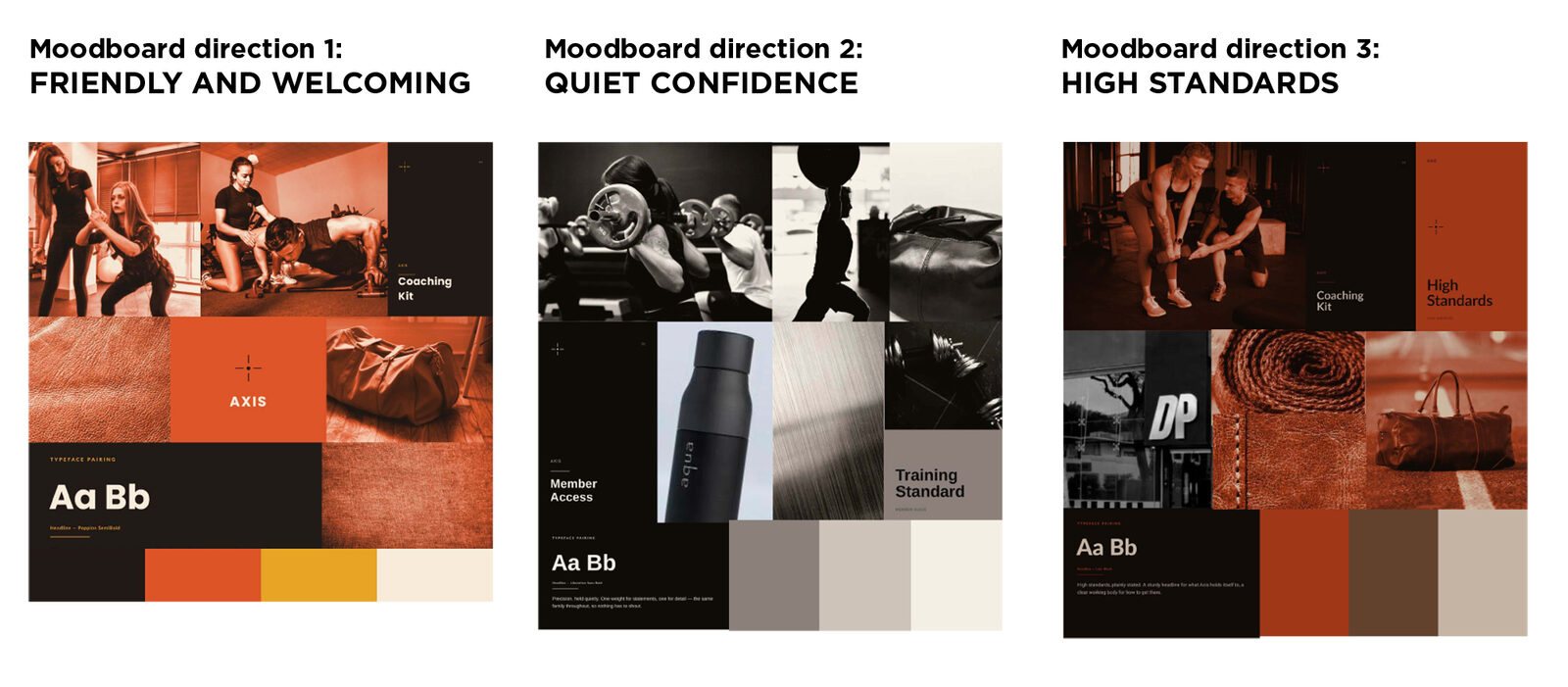
I put together three moodboard directions, each built from Sean's own words and a look at the competition around South Dublin. Sean went in set on the second, then found himself drawn to the third. It tied back most closely to the strategy, with imagery that looked like the sessions Axis would actually run.
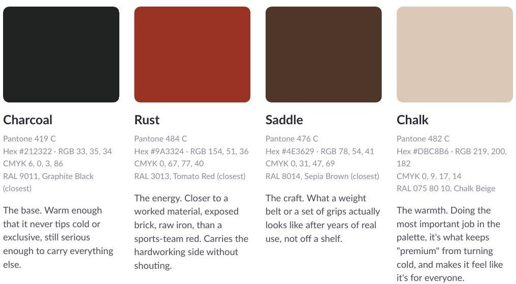
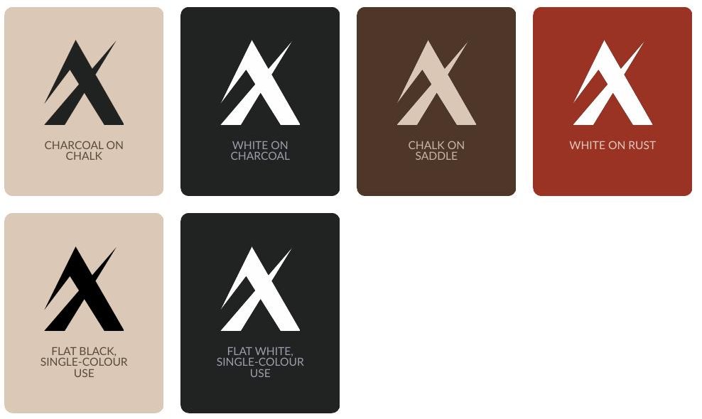
His first instinct on colour had been black and silver. We moved away from silver early, because it's hard to reproduce in flat colour and expensive to print. Charcoal leads instead, with Rust for energy, Saddle for craft and Chalk for warmth, so "premium" never turns cold.
A peak, an A and an X.
It started in a sketchbook, working through ideas Sean had given me: a centre point, rotation, connection, a coach who's hands on.
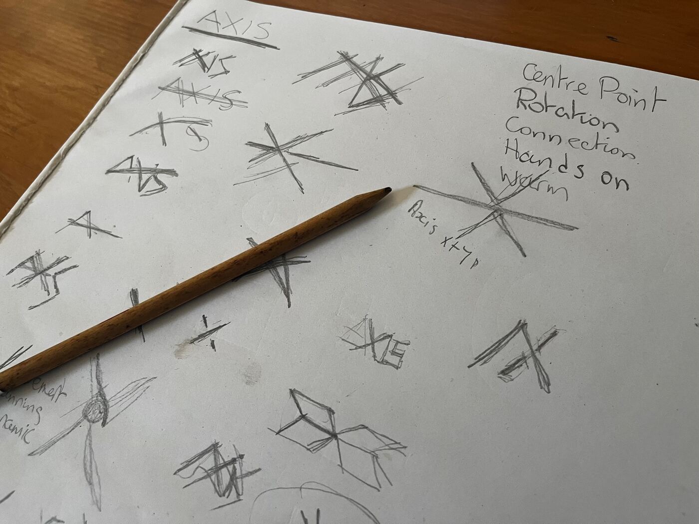
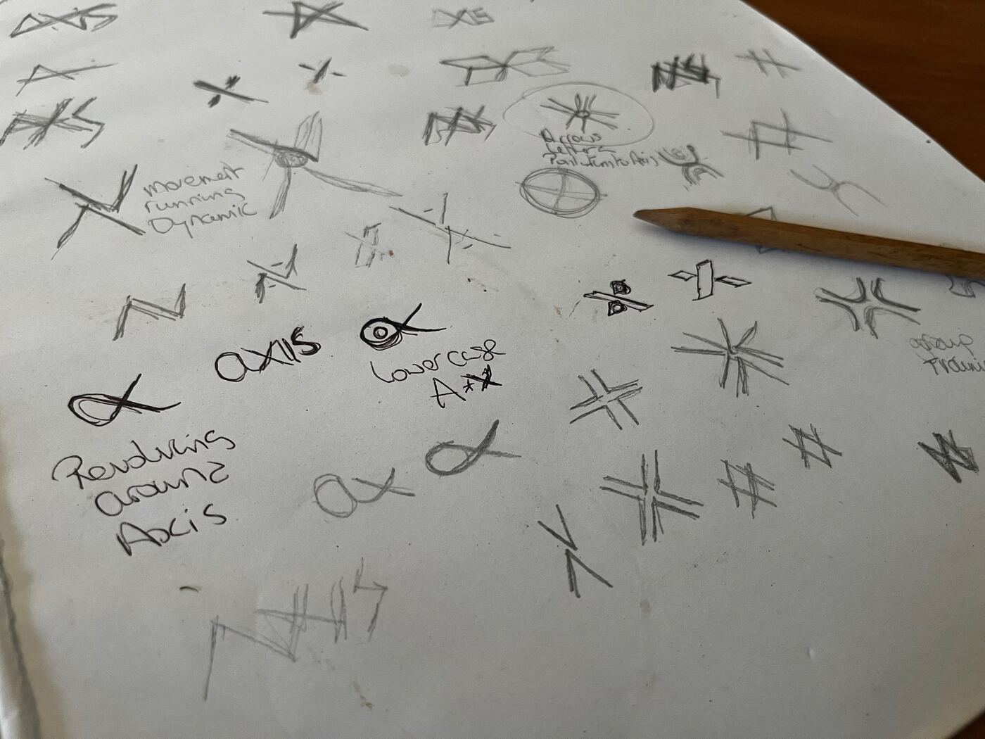
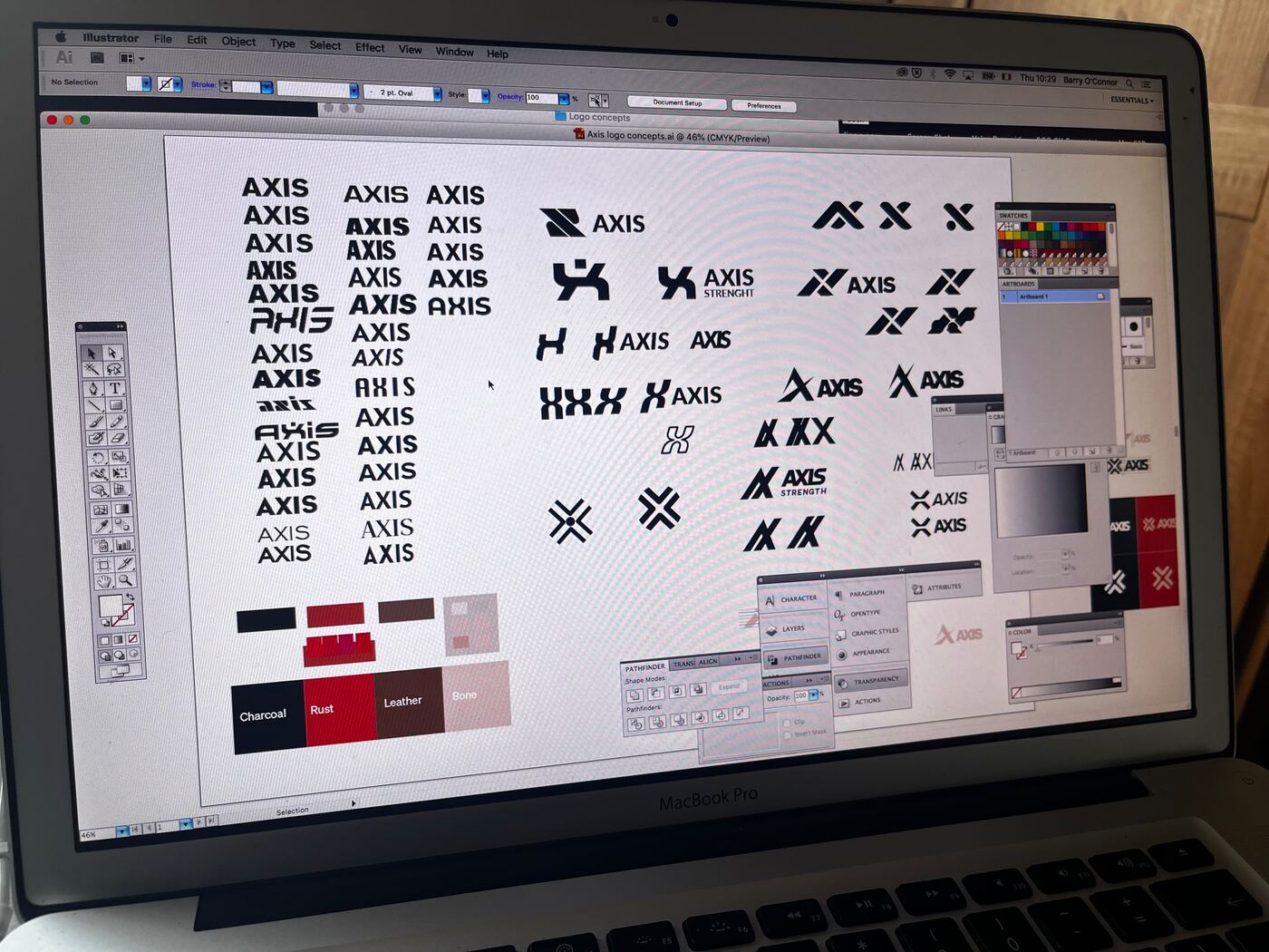
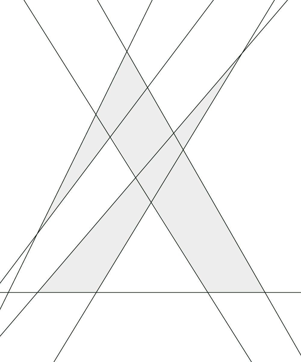
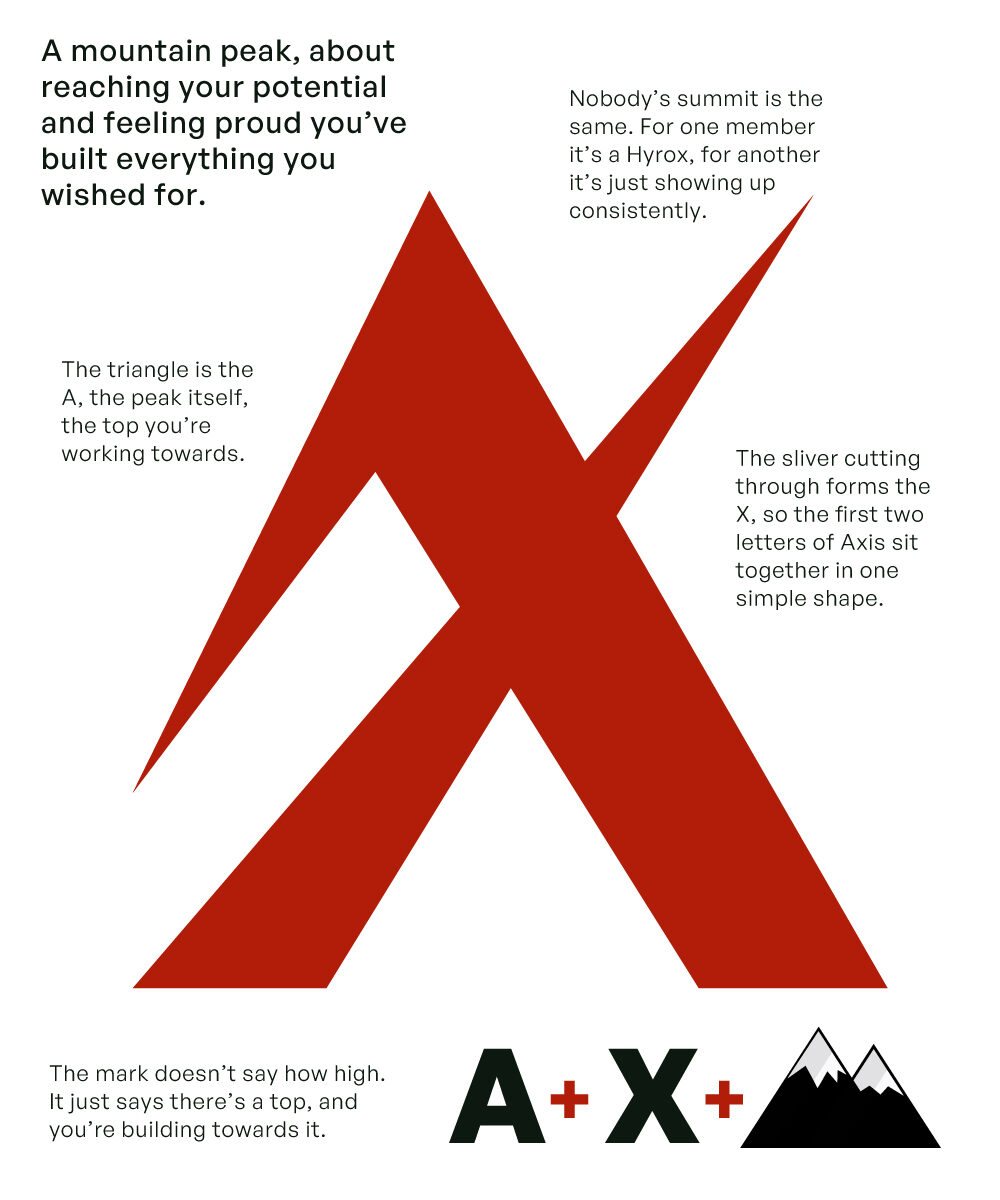
From those sketches I developed four logo directions, each built from the same two letters, A and X. Sean chose the Mountain Peak. The triangle is the A, and the sliver cutting through it is the X, the axis. The idea came from something Sean said about reaching your potential, and feeling proud that you built what you set out to build.
It doesn't assume what anyone's summit is. For one member it's a Hyrox finish. For another it's showing up three times a week for a month. The mark just says there's a top, and you're working your way towards it.
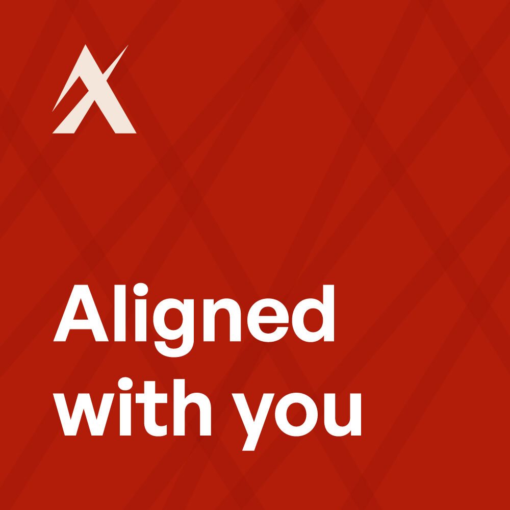
Aligned with you.
We tried a few taglines along the way. The one we landed on goes straight back to what the name means. An axis is about alignment, and that's the job of a good coach: watching closely and fixing your form before a bad habit sets in. The coach works with you, not at you.

Everything ready at once.
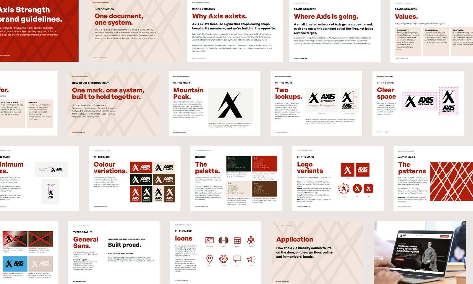
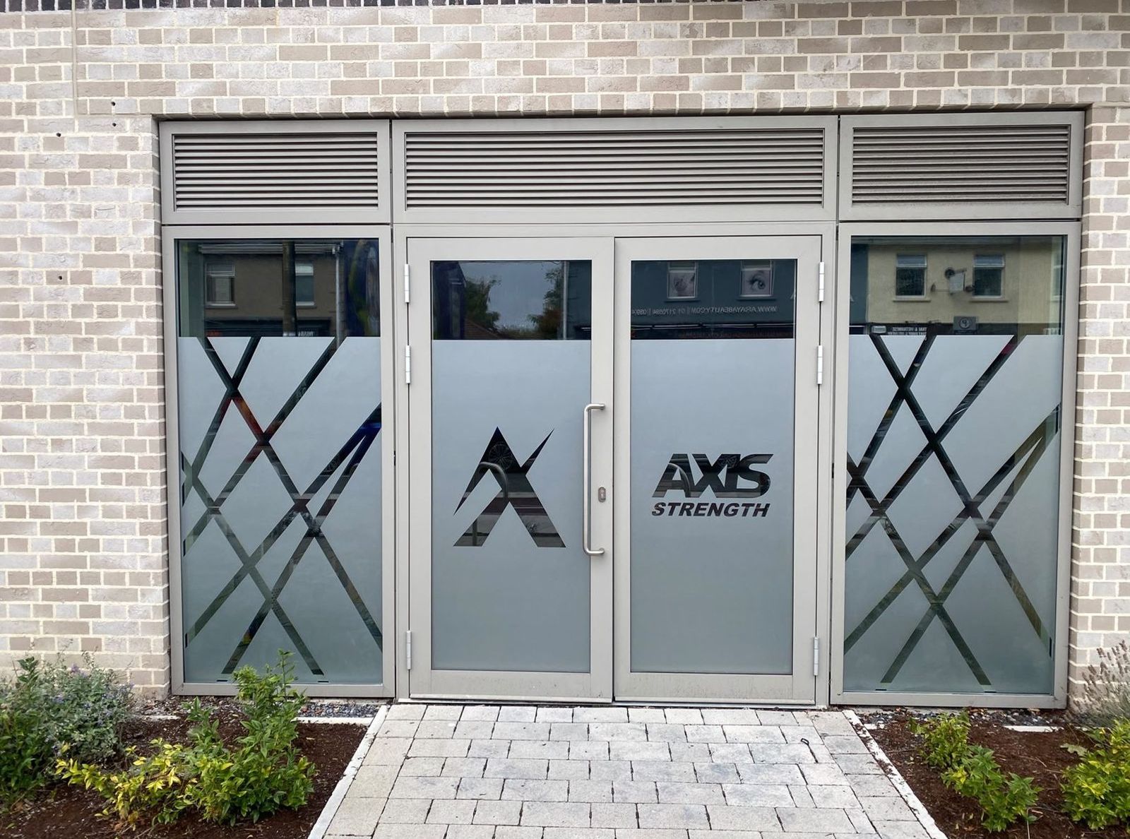
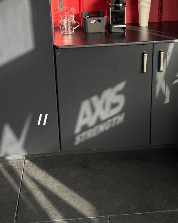
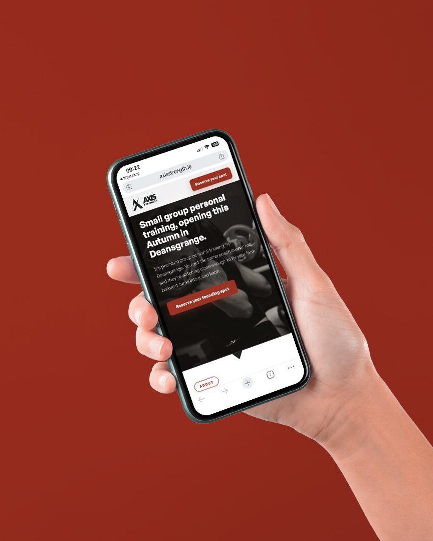
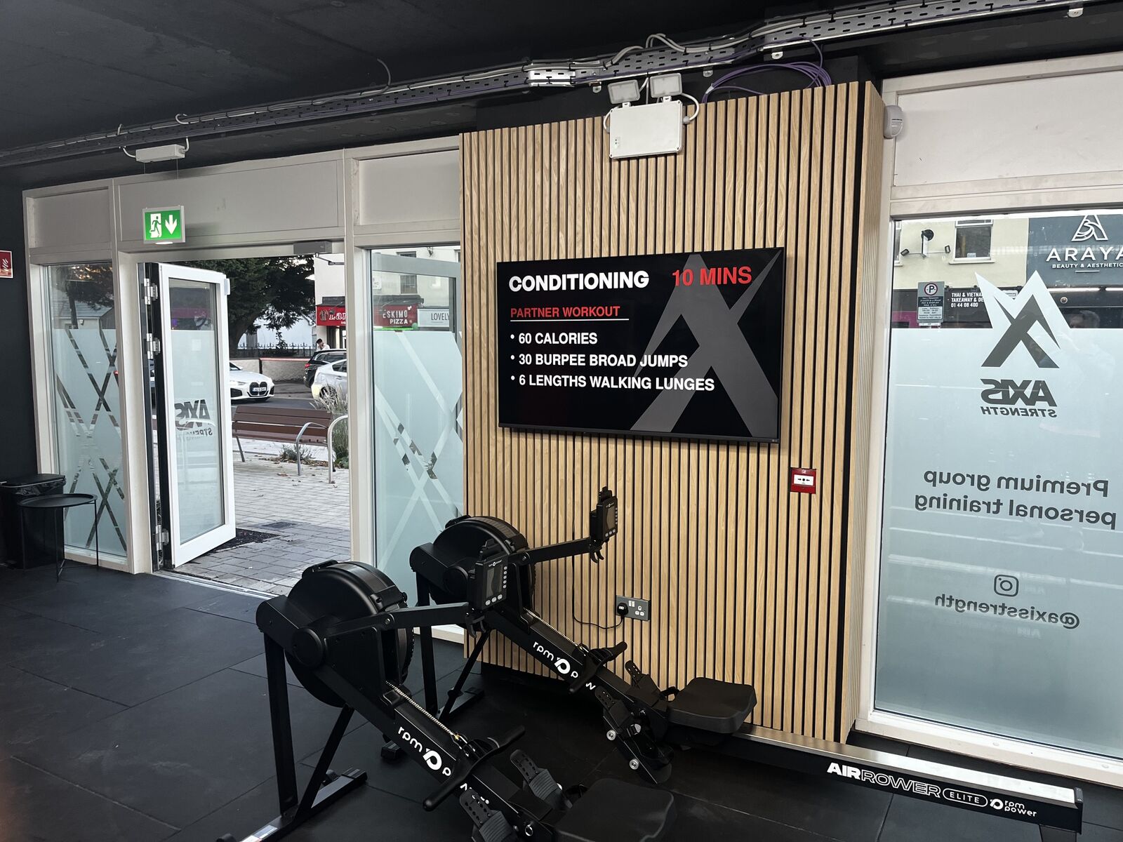
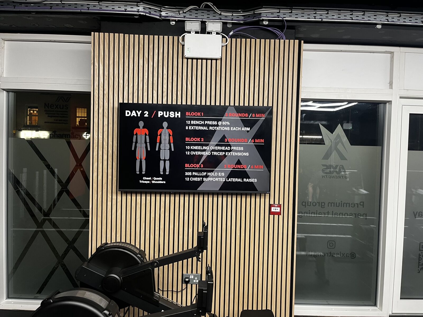
With a fixed opening date, the brand had to go out everywhere together: frosted shopfront and door vinyls with QR codes straight to the website, an external flag sign and floor mats, a launch website I designed, wrote and built, a social media kit with profile images, covers and a countdown sequence to opening day, workout screen layouts for the studio TVs, and a set of brand guidelines so Sean, his coaches and his printers all work from the same rules.
Founding memberships were sold upfront through Sean's booking system, so the founding spots went to people who were serious.
One page, one job: forty founding spots.
The launch site had a single job: get the first 40 members to reserve and pay before opening day. Most people would arrive on a phone, from the QR codes on the door or from Instagram, so I designed every section for mobile as well as desktop.
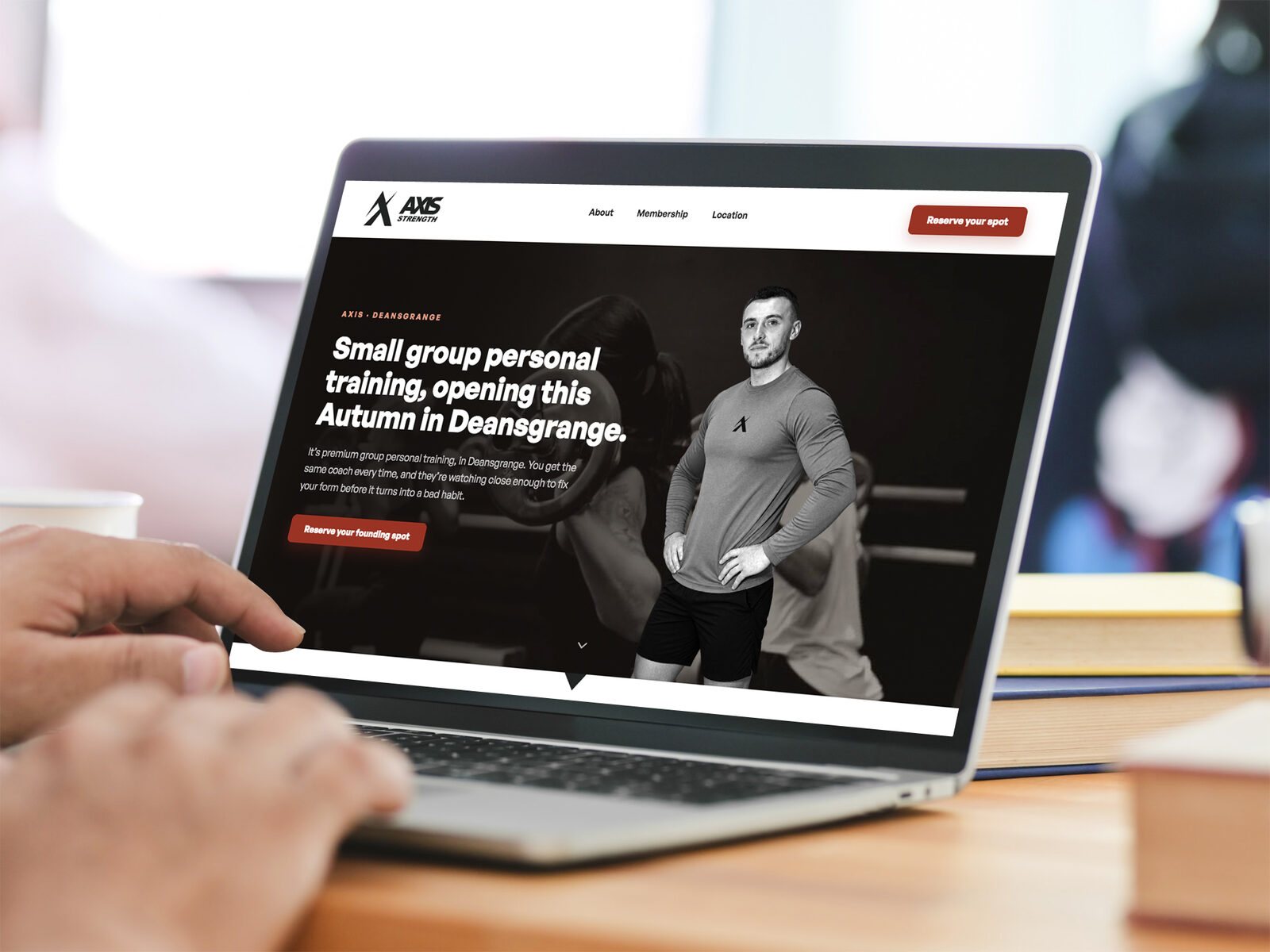
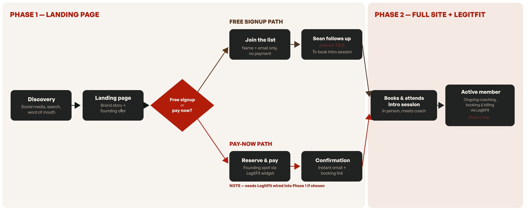
The biggest decision was how people would join. A free waiting list is easy to sign up to and just as easy to ignore. Instead, founding members paid upfront through LegitFit to reserve their spot, so every name on the list was a real commitment. A founding rate, locked in for as long as they stay, gave people a reason to commit early.
I mapped both routes before we chose. A free list meant Sean chasing every name to book an intro session. Paying upfront took people straight to a confirmation and a booking link, with no chasing at all.
The rest of the page answers the questions people have before they hand over their card: who's coaching, how big the groups are, when sessions run, what it costs and whether they can cancel. The privacy and refund terms were live before the first payment, not added afterwards.
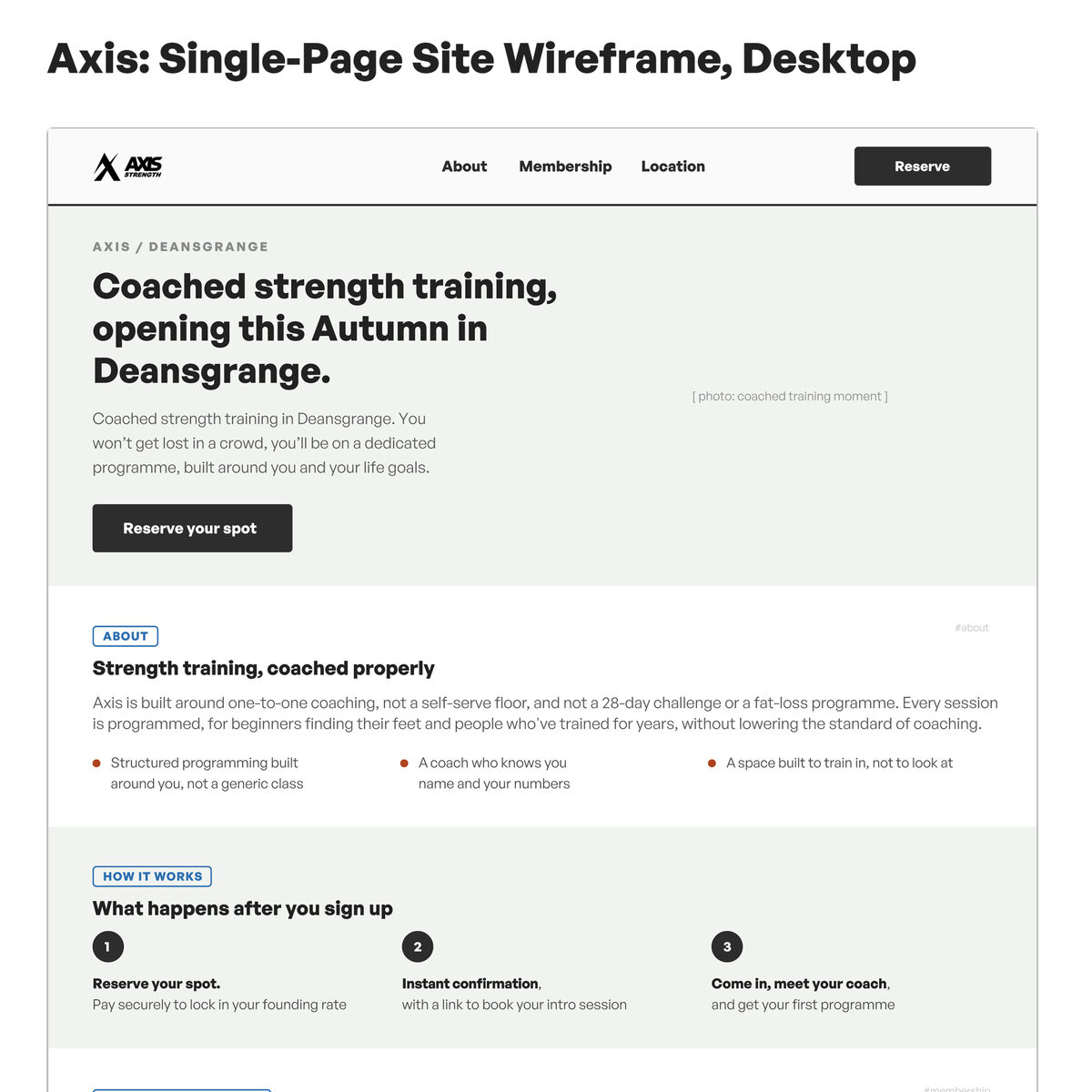
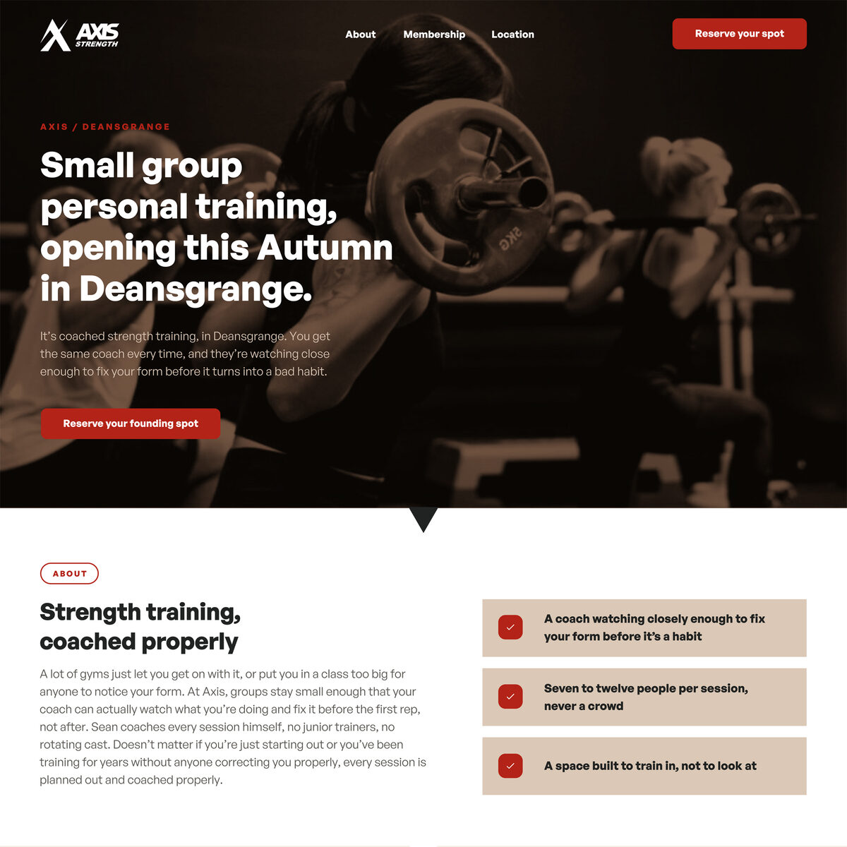
From wireframe to finished design.
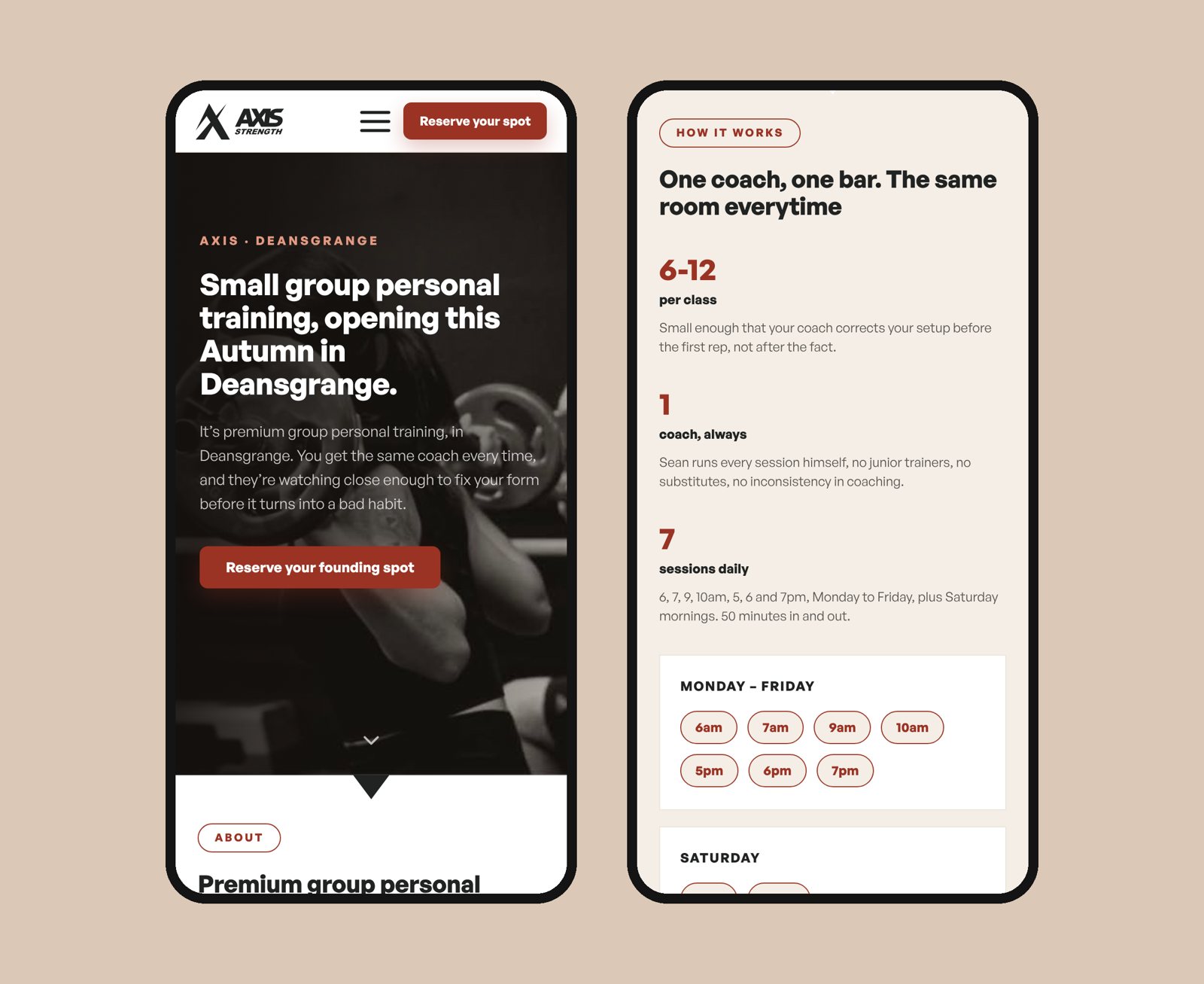
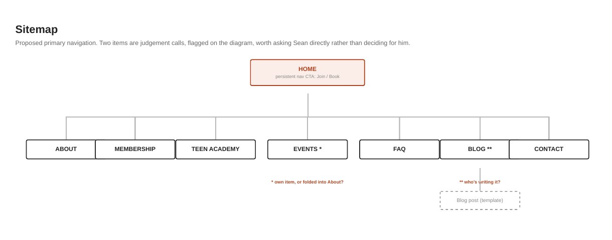
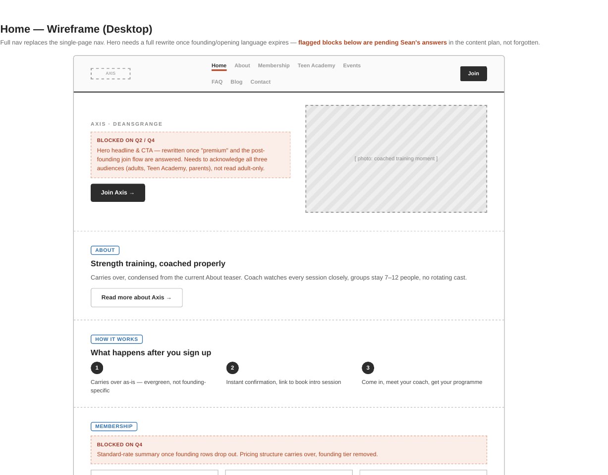
It was built as page one of the full site, not a throwaway. Before launch I'd already mapped the next phase: a sitemap and wireframes with room for all three of Axis's audiences, the adults, the Teen Academy and the parents who pay for it, with the questions only Sean could answer flagged rather than guessed.
“I knew how professional my business idea was, and I wanted the public to see it the same way I do. [Barry] created the full brand identity for Axis, and he's the reason the brand looks the way it does today. People regularly mention how professional it looks and the premium feel it gives.”
Starting something new? Let's make sure people trust it from day one.
A 30-minute call about where you are and what your brand needs to do. No pitch. If you're not ready to talk yet, ask for a free review of your current brand instead.