Taking design to new heights
Redesigning the UX/UI of Flight Bookings
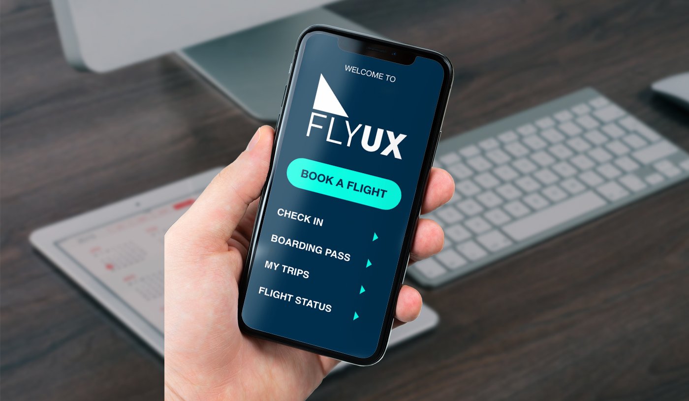
The UX design project was completed as part of a professional diploma course offered by the UX Design Institute, accredited by Glasgow Caledonian University. The aim of the project was to design a flight booking app that simplified the booking process and improved the user experience.
My Role
I served as the sole UX and UI designer for the project. My approach to the project involved several Design Thinking methods, including user research, user interviews, interaction design, wireframing, prototyping, and UI design.
PHASE 1: RESEARCH
The first phase of the project involved conducting research to understand the users' goals and experiences when using flight booking apps. I used competitive benchmarking, online surveys, and usability testing to identify pain points that users face in the booking process and to find solutions.

COMPETITIVE BENCHMARKING
I reviewed and compared direct and indirect competitors to better understand their user experience and booking process.
ONLINE SURVEY
To gain further insight into how users interact with airline booking apps, I conducted an online survey. The survey included multiple choice and open-ended questions to gather qualitative and quantitative data on users' priorities, objectives, and goals when booking flights.

USER TESTING
I conducted remote usability tests using competitors' apps to gain insight into users' goals and previous booking experiences. I observed users interacting with the apps and took notes on what they did and said during the booking process. The usability tests were recorded to ensure that no important details were missed.

PHASE 2: DEFINING THE PROBLEM
After completing the research, I moved on to defining the problem. I broke down the data into an affinity diagram, created a customer journey map and mapped out the user flow through the app.

AFFINITY DIAGRAM
Using an affinity diagram, I organised the key information into groups and identified patterns that emerged from the groupings. These patterns were used in the design phase of the project.

CUSTOMER JOURNEY MAP
I created a customer journey map to simplify the flow through the new app design. Each step focused on the user's goals, behaviours, and pain points.
USER FLOW
I mapped out the user flow through the app, from the home screen to checkout, aimed at solving the pain points found in my research.

PHASE 3: UI DESIGN
With research data and diagrams to refer to, I started designing the app to address the user problems.
INTERACTION DESIGN
I designed interaction screens by sketching and iterating on possible solutions for different screen states. The sketches helped to define the information architecture and navigation for the app. After several iterations, I created a low-fidelity interactive prototype in InVision to further define the screen and booking process.


HIGH FIDELITY PROTOTYPE
I created a high-fidelity prototype in Adobe XD to convey richer interactions from the user and gain greater data and insights. The design then went through more user testing and iterations to validate or find flaws in the overall design.
WIREFRAMING
After going over the prototype and fixing issues that arose from the usability test, I prepared the wireframes for handover to be developed. These were sent with the working prototype and mobile interaction flow so that the developers could get started.

WHAT I LEARNED
Throughout the project, I learned about product design, human interaction design, the design thinking process and what goes into creating a digital or physical product. I discovered the importance of research and usability testing throughout the design process as it helps to validate the design and identify any issues and areas for improvement.
It was a great learning opportunity to increase my knowledge in the field of UX Design.